Create charts
If you have not read it yet, please start with Create reports tutorial.
This tutorial introduces you to the main flex.bi chart types and shows exactly how to select data for these charts and change chart options. You can try to create charts using demo Invoices cube.
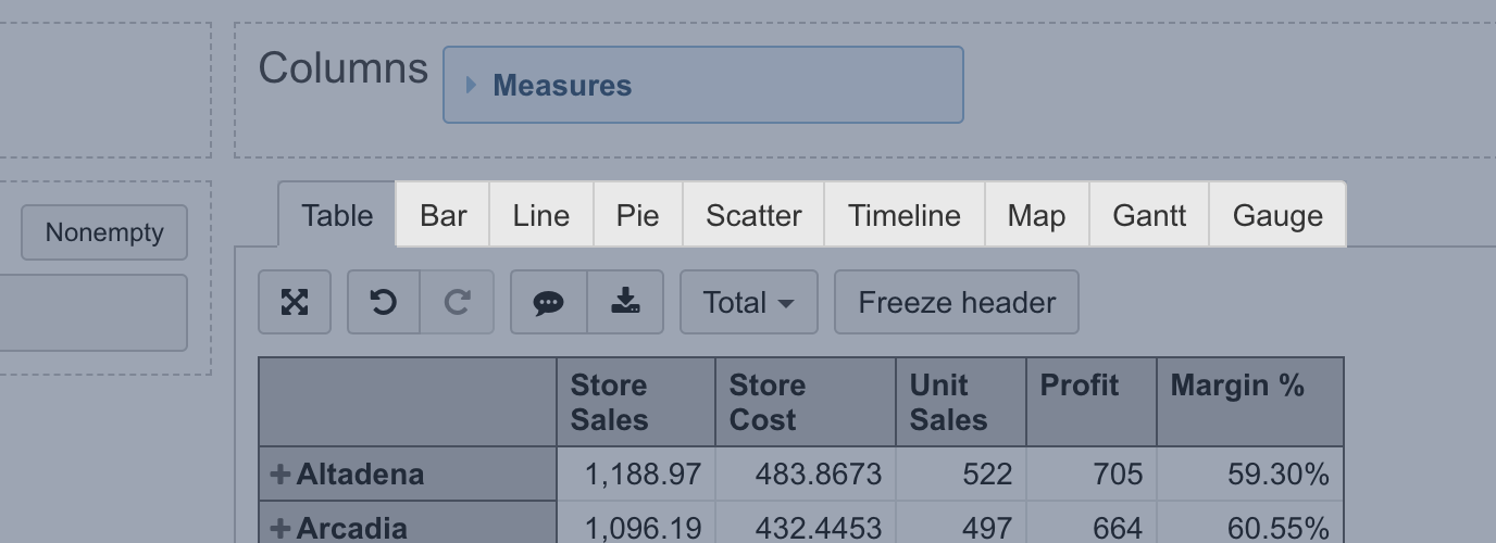
We recommend first, build a report in a Table view and then select a chart type most suited for representation.
Bar chart
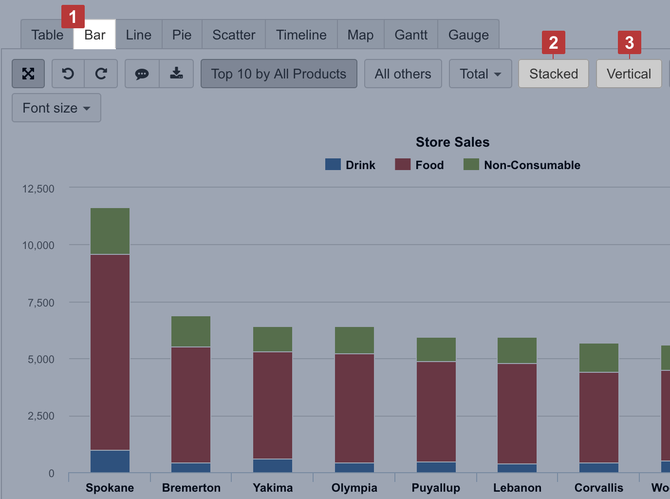
Select the Bar chart [1] to represent data comparison in columns or bars [3]. Select Stacked [2] to show a composition of similar items; you may have several stacks to group similar measures.
Line chart
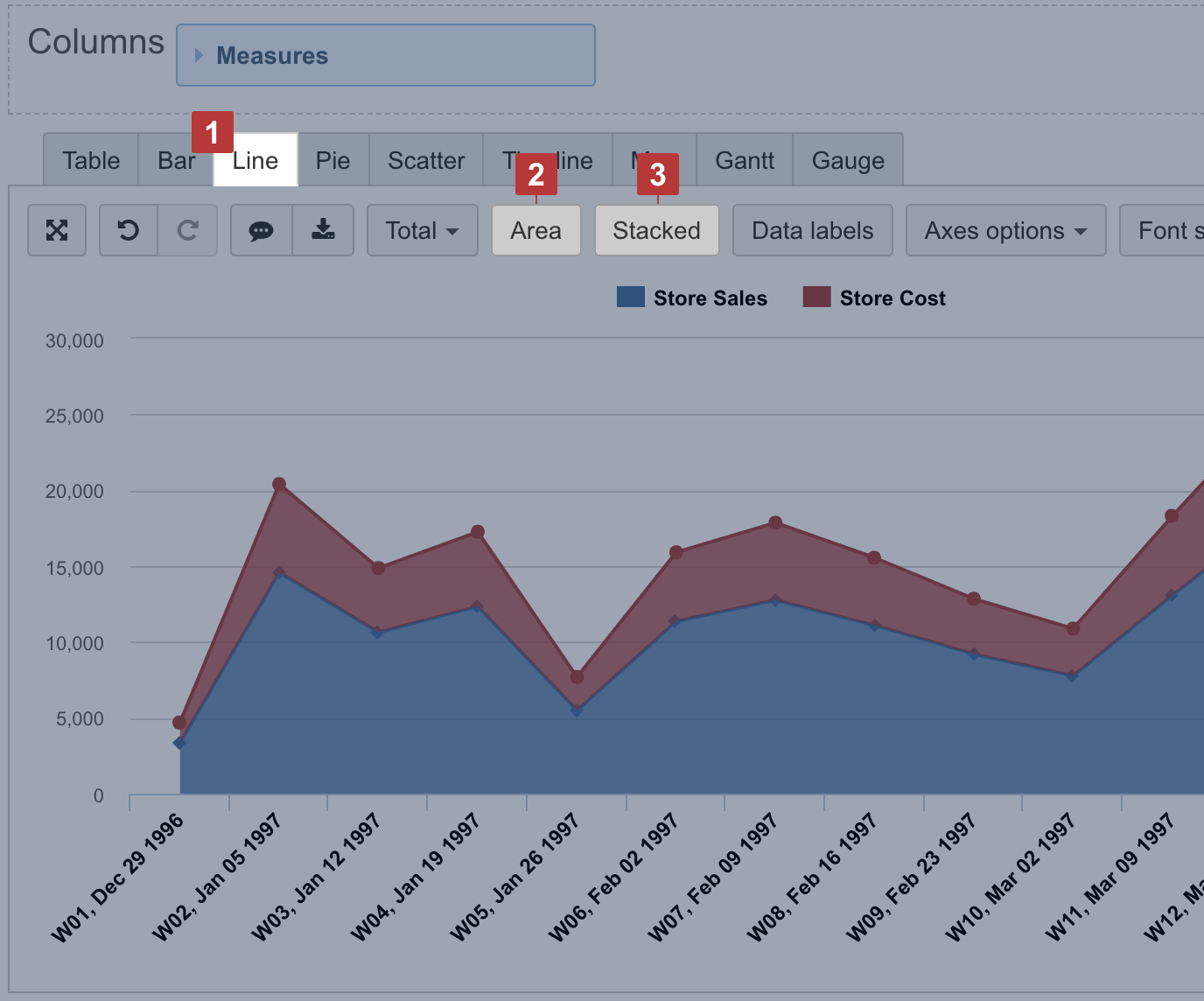
Select the Line chart [1] to represent trends of a continuous data set. To represent accumulative value changes over time, select Area [2]. For area chart, you can also select Stacked [3] to show changes in a composition of similar items.
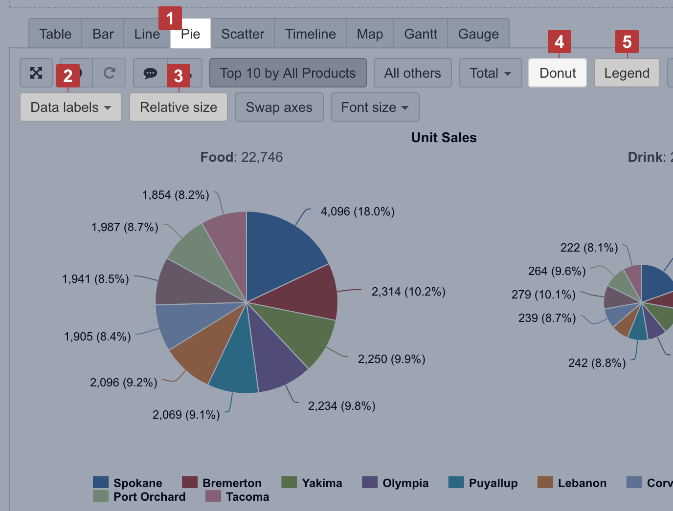
Pie chart
Select the Pie chart [1] to illustrate the proportions of a whole composition. You can represent each proportion value as numbers and as a percentage [2] of the whole. Select Relative Size [3] to show all compositions proportionally based on value.
To compare segments ratio between composition, you can use the Donut [4] chart. You can think of a donut chart as being a stacked bar graph that has been curled around on itself.
If you show data labels and percentage for each slice, you can hide the legend [5].
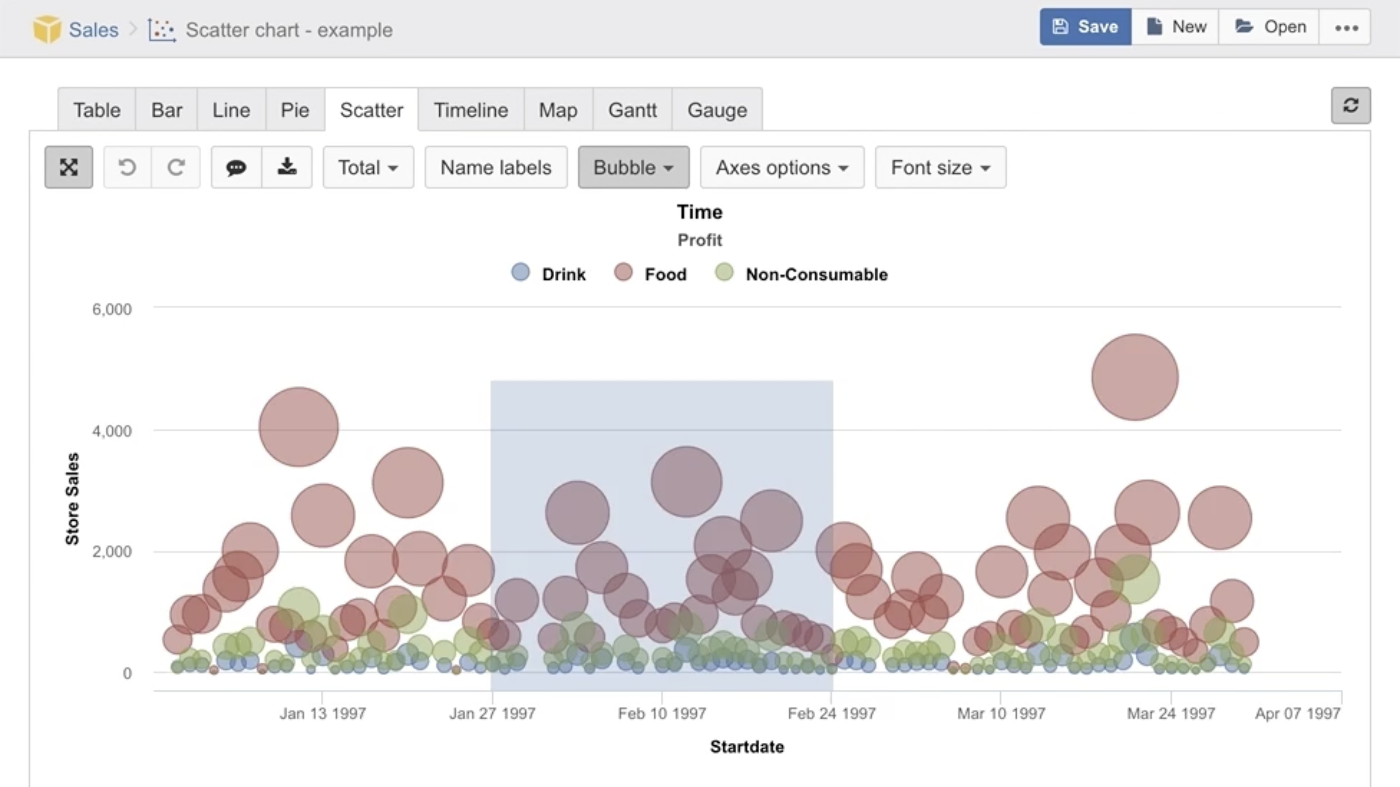
Scatter chart
Select the Scatter [1] chart can be used to display the correlations between two different measures (numeric values) representing each measure on separate axes. X and Y axis are adjusted automatically according to the values of selected measures.
For representing relations between three measures, you can use Bubble [2] chart. Two measures are placed on axes and the third measure determines bubble size.
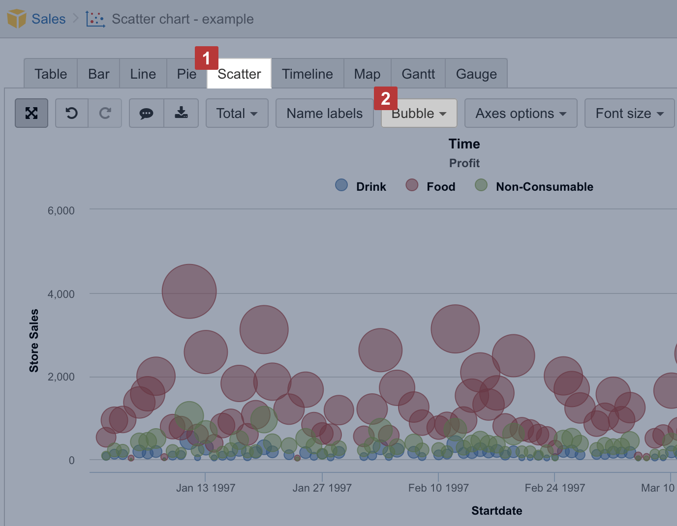
You can select more cluttered part of Scatter chart to zoom in.
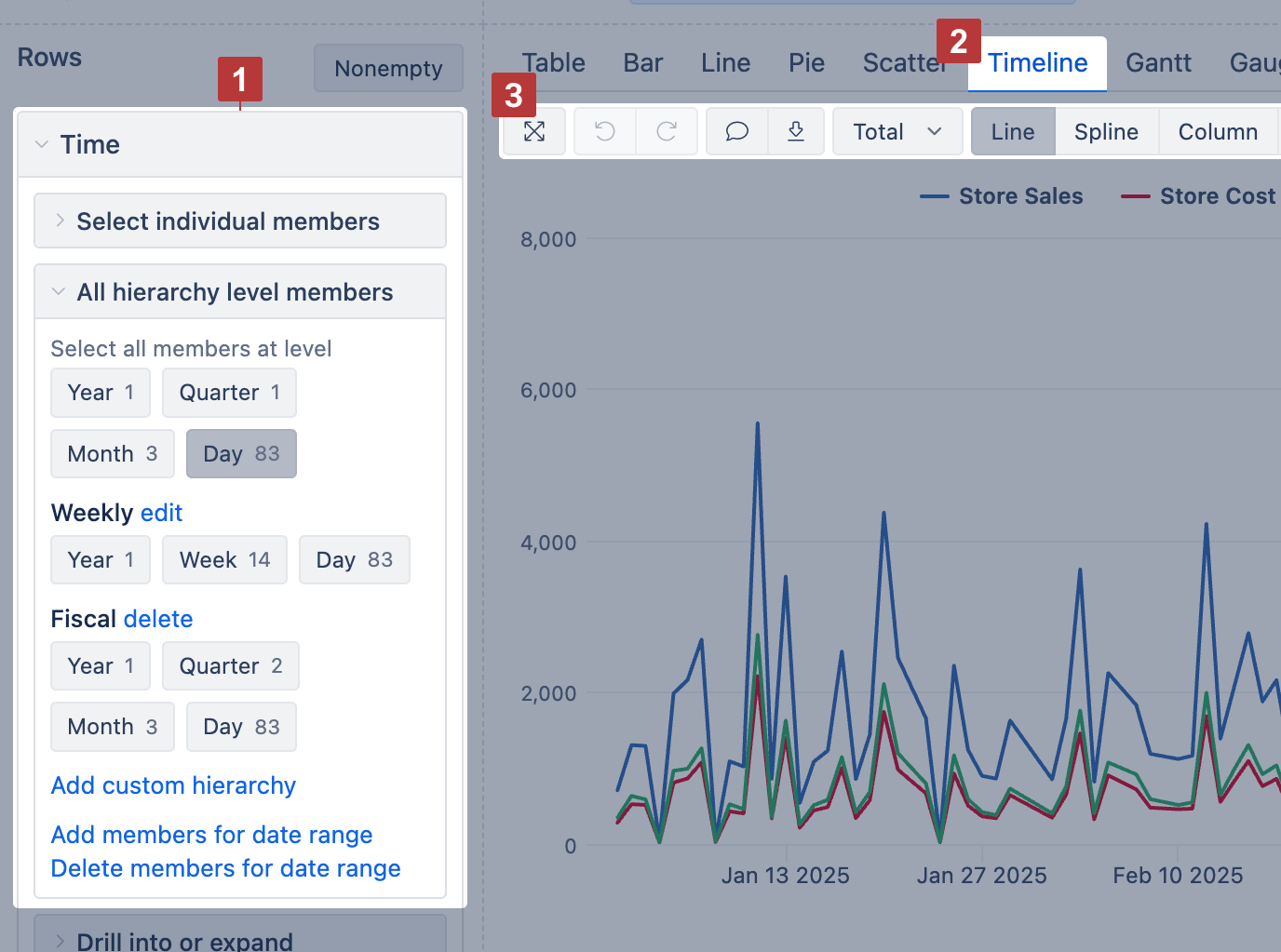
Timeline chart
Use the Timeline chart [2] to show continuous data changes over time. It works like a line chart but connects data points across time, even if some time periods have no data.
Start by placing the Time dimension [1] on rows (selecting the desired hierarchy like year, month, or day) and measures on columns. Then switch to the Timeline chart [2] to customize the chart display.
Show values as lines, splines, columns, or areas—whichever fits your data best.
To focus on a time range, drag across the chart to zoom in. To change the period shown in the report, apply a Time filter instead (which saves the filter selection).
Timeline chart options [3]:
Line / Spline / Column / Area – switch how all measures are displayed
Stacked – group area values by row members (only with Area)
Values / Percentage – switch between absolute values or percentages (only with Stacked)
Data labels – show values at each point; with Stacked, switch to values, percentage, or both
Axes options – adjust Y axis title, label prefix/suffix, or min/max values
Font size – change chart font size (small, medium, large)
Map chart
If you have some dimension with countries or regions or data with geographical coordinates (latitude and longitude) you can represent data distribution on the Map [1] chart. flex.bi provides two types of maps.
You may visit Demo account to see both map examples: https://flex.bi/bi/accounts/47/dashboards/460-maps-with-geocoding
Static map
Use Static map when you have regions mapped with the ISO two-letter codes or country names. If you map data with the country names, make sure that the used variations of the county names are recognized in the map chart by flex.bi.
Select dimension containing region and country two-letter codes [1] on rows and necessary measures on columns. The first column [2] is used to calculate color intensity for each region.
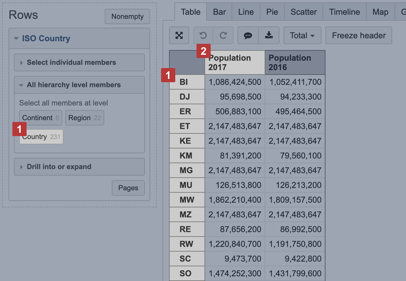
Then switch to Map [1] chart and select Static [2] view. You may also select the region [3], like, world map, Europe map or particular country map, to change between available maps. The region color intensity is calculated on measure value [4] from the first column. When hovering a mouse over the region, you see measure values from all columns.
Dynamic map
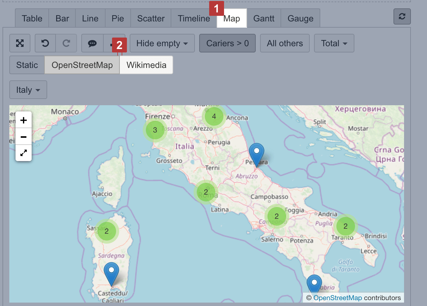
Use dynamic map when you have geographical coordinates (latitude and longitude) for dimension members to represent their location on the map.
Select a dimension containing objects with coordinates on rows and necessary measures and coordinates on columns [1]. The first column should hold latitude and the second column should hold longitude [2] to place coordinates correctly. Use some numeric measure [1] to give a context for the report; this measure might be as the third column or filter.
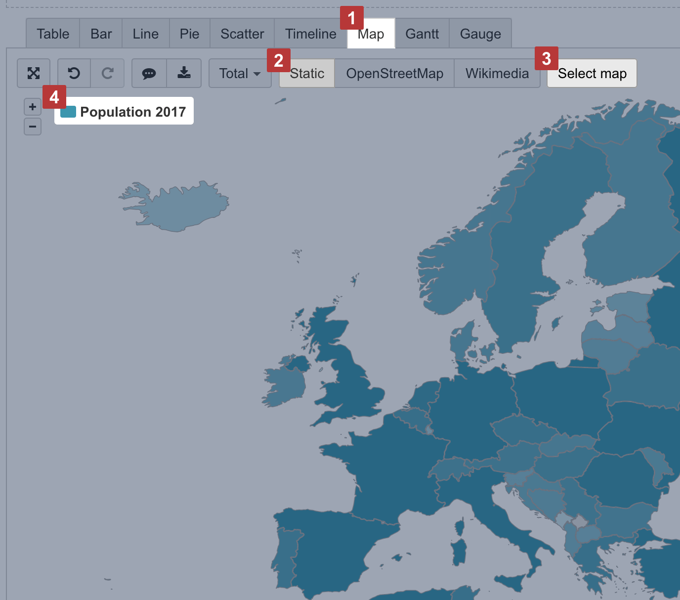
Then switch to Map [1] chart and select OpenStreetMap or Wikimedia [2] view to see how many objects (dimension members) are in each region.
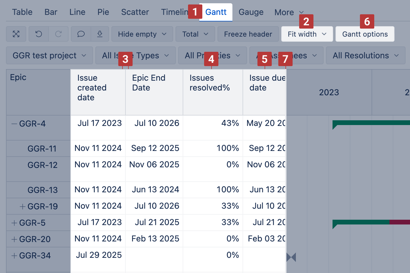
Gantt chart
Use the Gantt chart [1] to illustrate scheduled tasks and their progress on a timeline. The timeline can be displayed in various granularities: Daily, Weekly, Monthly, Quarterly, Yearly, or Fit width [2].
To build a Gantt chart, place projects or tasks on rows and select at least two date measures [3] in columns:
Start date – set it as the first column;
End date – set it right after the start date column.
A bar connects the start and end dates on the timeline. If the start date is missing, the end date is marked with a diamond.
Additional Columns:
Progress [4]: You can add a percentage measure (%) to the report to automatically display the completion progress on the task bars. If the value is below 100% and the end date is in the past, the task will appear as overdue.
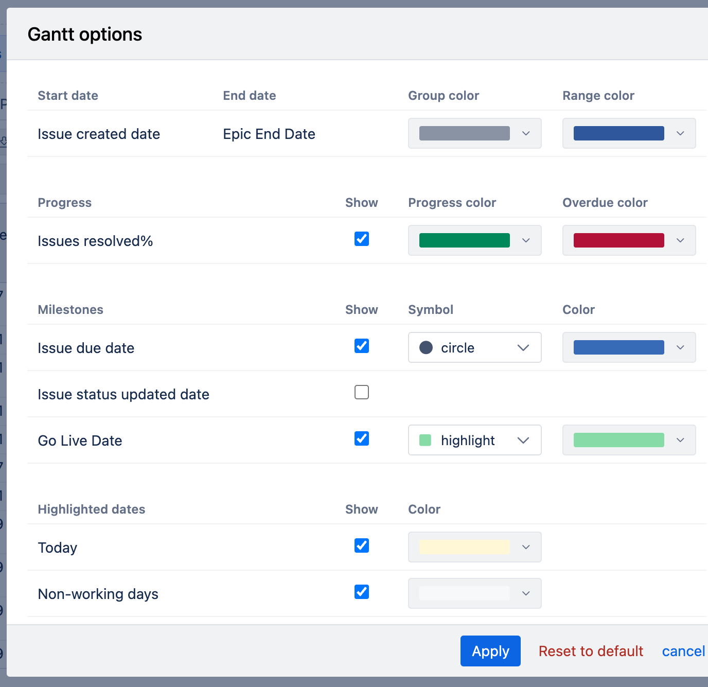
Milestones [5]: You can add other date measures to the report. In the Gantt options [6], enable their display as milestones.
Drag the vertical separator [7] to adjust the size of the table.
Gantt options to adjust the chart appearance:
Group color: Applied to parent tasks. The entire parent bar is shown in this color, or the unfinished part if the progress (%) is set.
Range color: Applied to standalone tasks (without a parent) and child tasks, coloring the entire bar or the unfinished part if progress (%) is set.
Progress color: Shows the completed portion of a task according to its progress (%). For example, if progress is 50%, half of the bar is filled with this color.
Overdue color: Overrides other colors if a task’s end date is earlier than today. The unfinished portion is shown in this color.
Milestones: Use the "Show" option to display milestones, selecting a symbol and color for each. The "highlight" symbol displays a milestone as a vertical line, useful for fixed dates across all groups.
Highlighted dates:
Today: Show the current day on the chart with a selected color.
Non-working days: Display non-working days with a selected color.
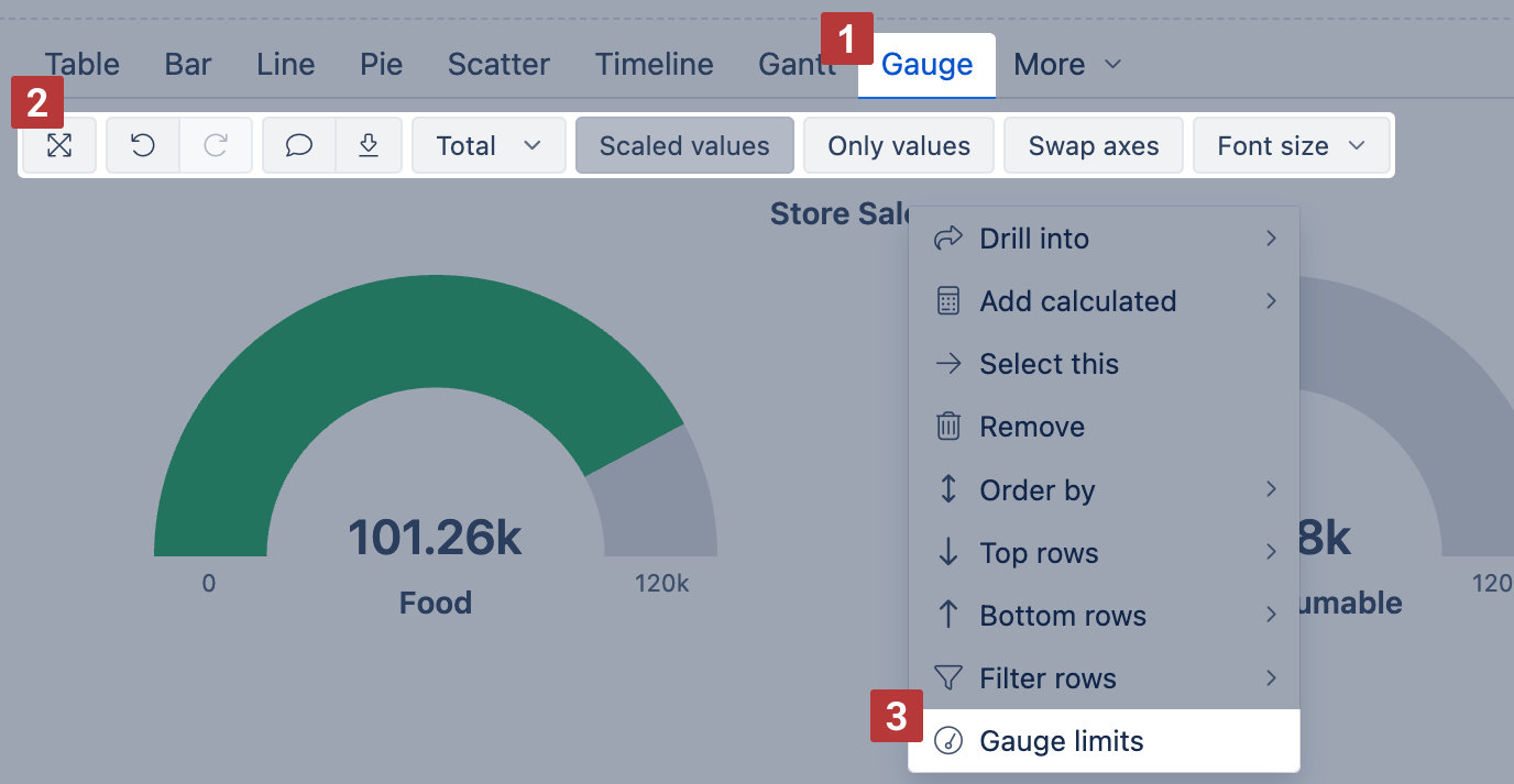
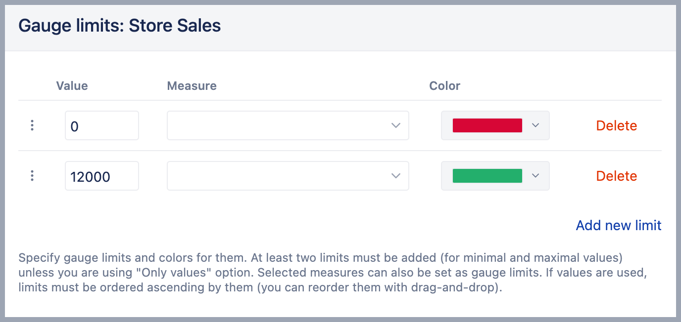
Gauge chart
Select Gauge [1] chart to show key performance indicators (KPIs) as color-coded gauges with progress towards defined limits.
Select Gauge limits [2] to set limits for measures and color-code for each limit range. If several gauges are displayed using the same measure and if you want to specify the same limits for all gauges then click on the common measure (or on the common member name) and select Gauge limits. If you need to add specific limit values for just one gauge then click on the gauge value and select Gauge limits.
To see an overview, you can use numerical values only [3], and for big numbers select Scaled values [4] to display values using k (thousands) or M (millions) suffixes. Additionally, add a Sparkline calculated measure to show a brief trend next to the number.
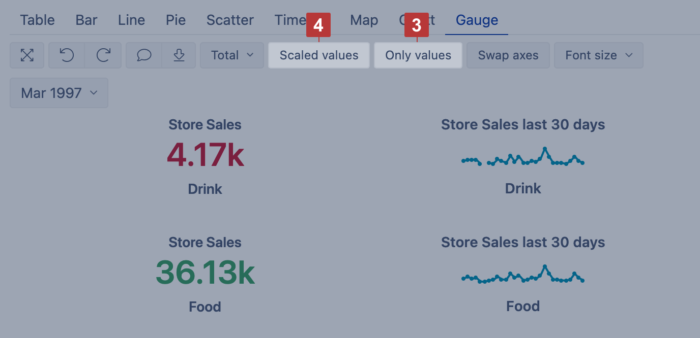
You can set a specific numerical Value or percentage as a limit for the gauge. In this case, you may use k suffix to enter thousands, M suffix to enter millions or % suffix to enter a percentage value. Or you can set another Measure as a limit. Note, this measure should be selected for the report as columns as well. To change the default color of Sparkline do not enter any value, but only change the Color of the limit.
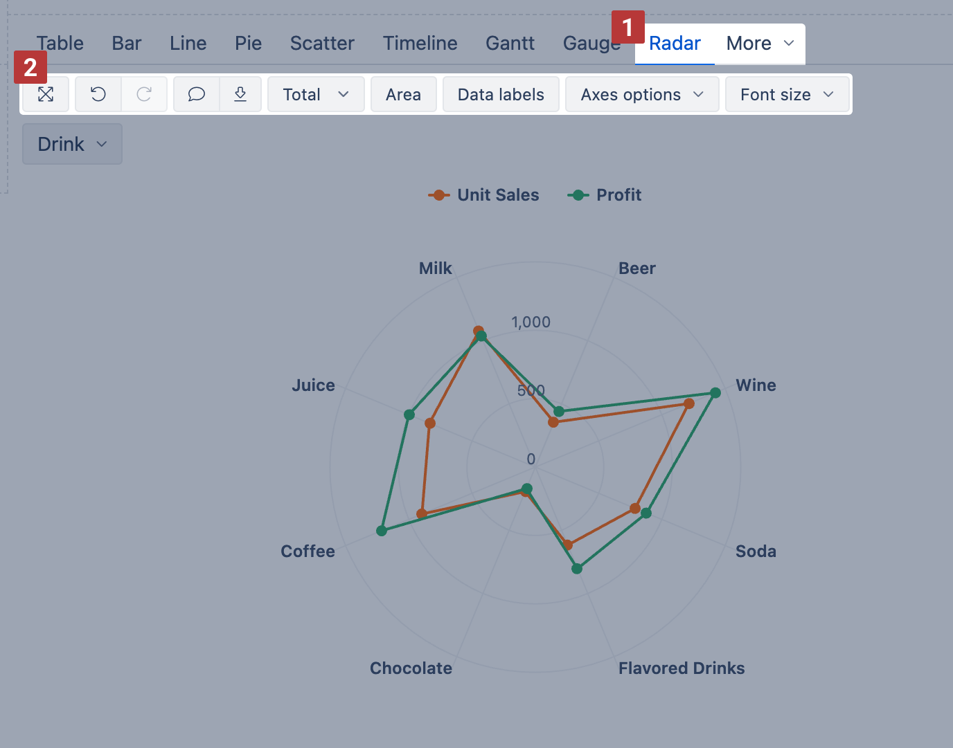
Radar chart
Use the Radar chart [1] (also called spider or web chart) to compare multiple measures across dimension members using the same scale. It’s great for spotting patterns, trends, or outliers in a compact visual layout.
You'll find the Radar chart in the More section.
You can display values as a line or an Area. For Area charts, enable Stacked to show cumulative composition.
Radar chart options [2]:
Area – fill the area under each line
Stacked – group area values by row members (only with Area)
Values / Percentage – switch between absolute values or percentages (only with Stacked)
Data labels – show values at each point; with Stacked, switch to values, percentage, or both
Axes options – adjust Y axis label prefix/suffix, min/max values, or Swap axes
Font size – change chart font size (small, medium, large)
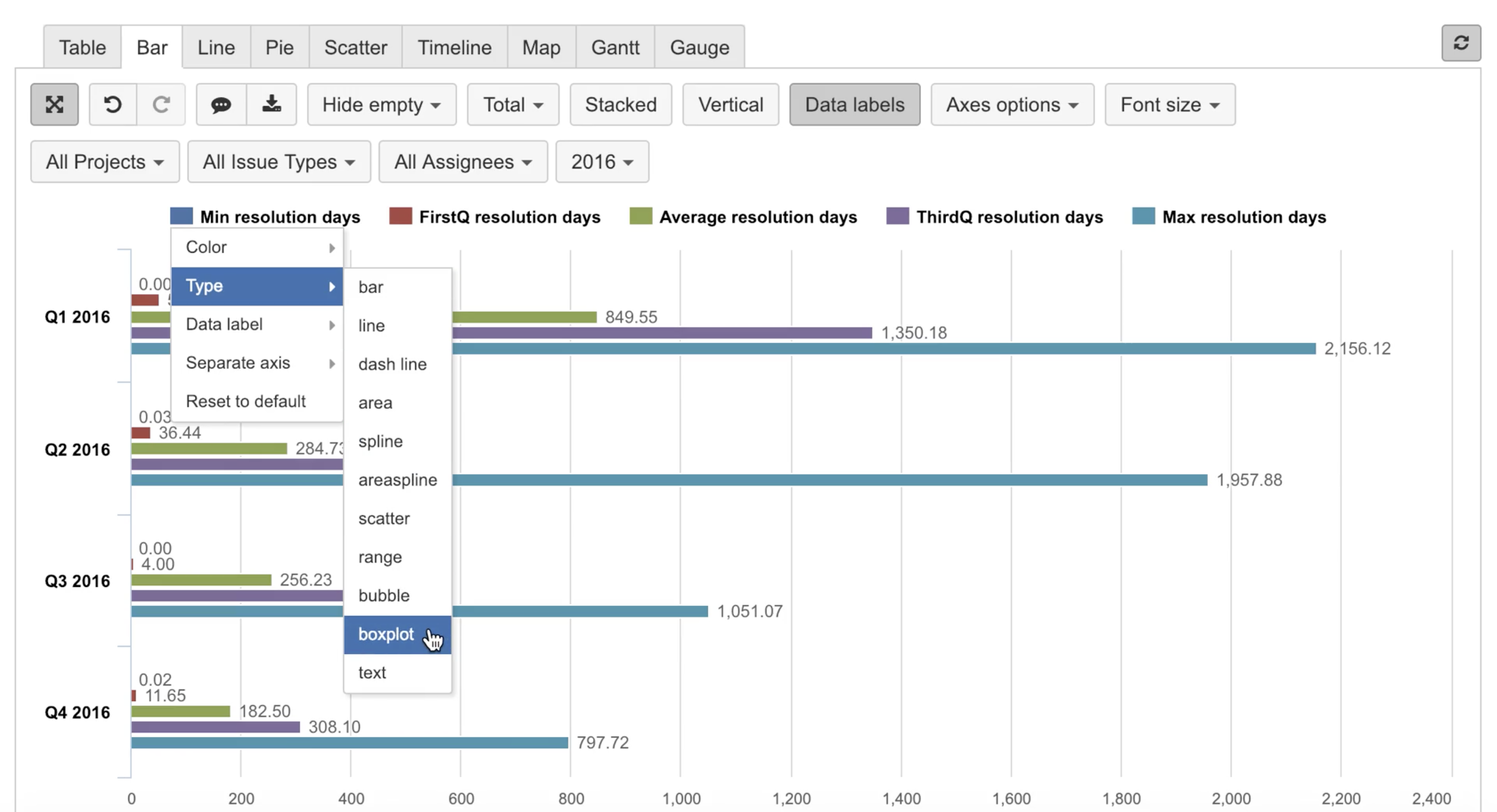
Boxplot chart
The boxplot chart type can be used for displaying the distribution of data based on five measures:
minimum (for calculations use function Min)
first quartile (for calculations use function FirstQ)
median (for calculations use function Median)
third quartile (for calculations use function ThirdQ)
maximum (for calculations use function Max)
The central rectangle spans the first quartile to the third quartile; a segment inside the rectangle shows the median and "whiskers" above and below the box show the locations of the minimum and maximum.
This chart type is available when all five measures are selected for a report.
Go to Bar chart view and for the first measure select type Boxplot.
Customize chart
You can customize the way measures and dimensions are displayed in a chart, and create mixed type charts.
Data labels
Select Data labels [1] to display measure values and change Font size [2] for better readability. For each measure, you may adjust data label position.
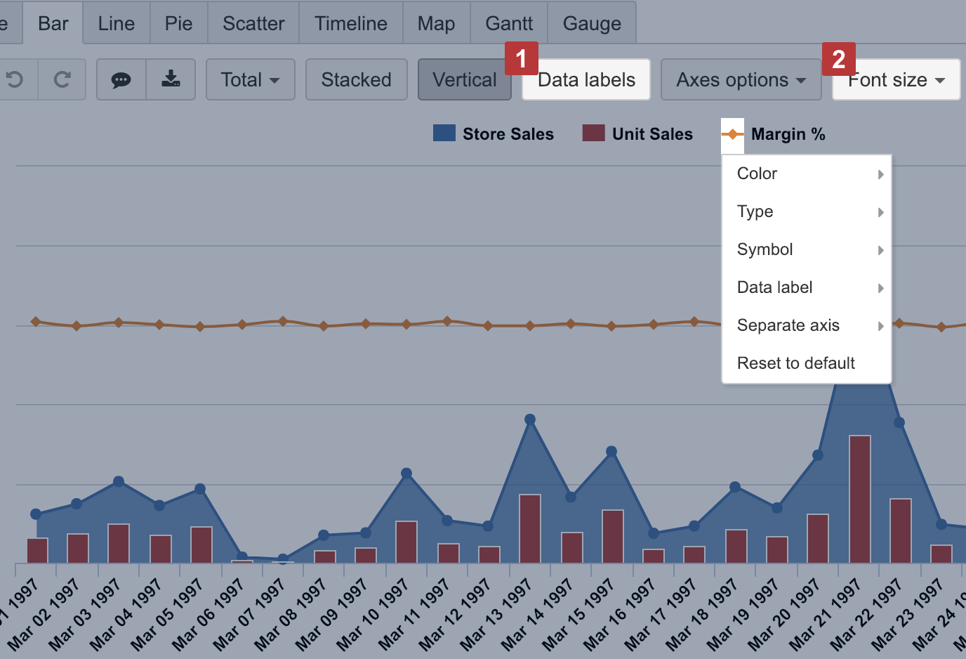
Chart types
Customize the way how each measure is displayed in a chart by clicking on a data marker in front of measure name and create mixed type charts.
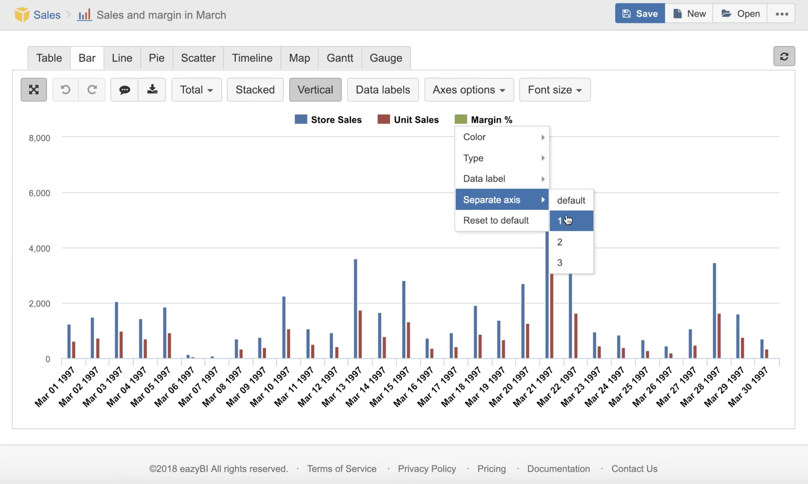
For measures with different units, for example, like sales and margin rate, it would make sense to display them on Separate axes to better see the coloration and with varying Types of chart to understand the distinction. You can also change the Color which resonates better with selected measurement nature.
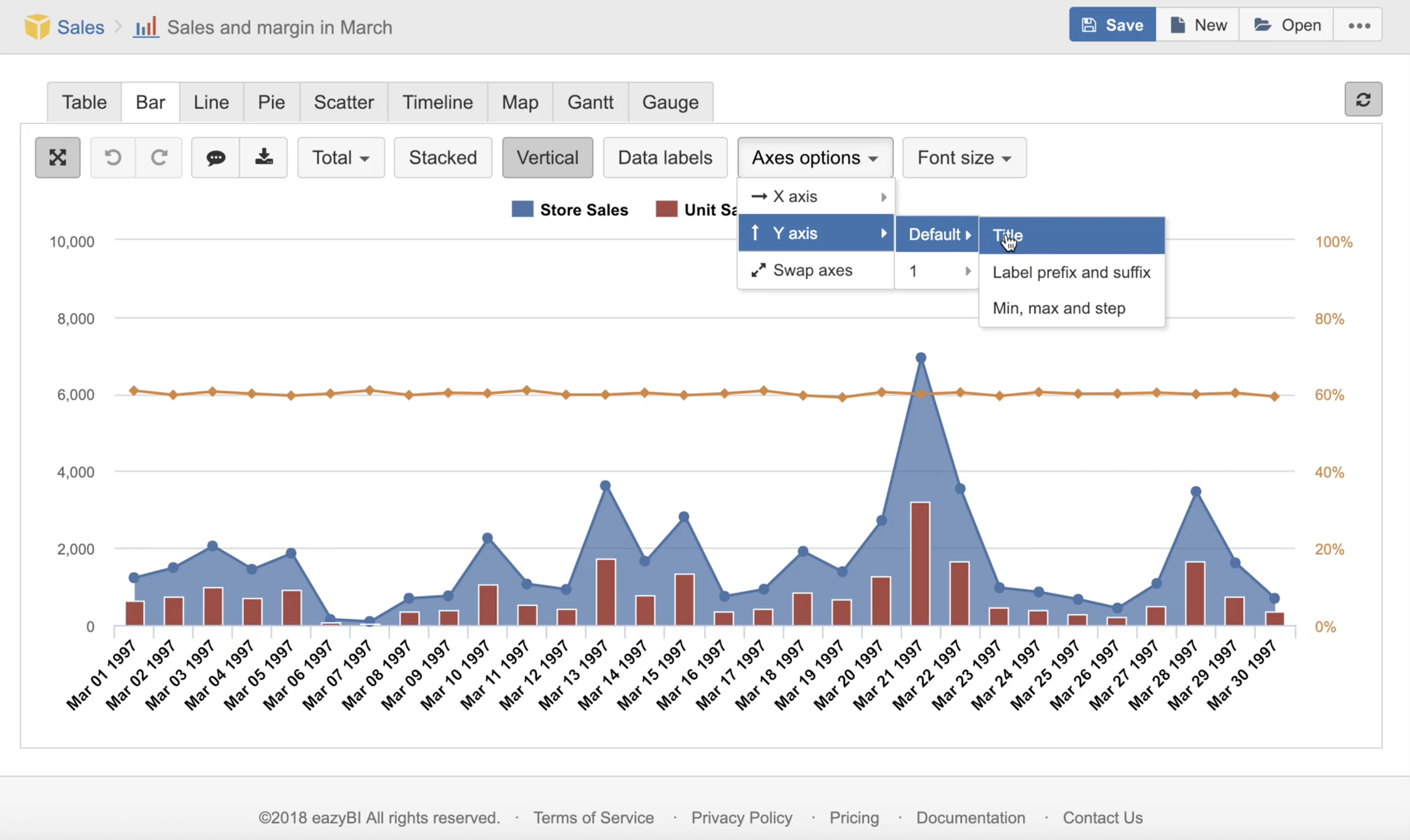
Axes options
Choose Swap axes to swap dimension and measure placement on X and Y axis.
Use Axes options to provide additional information and improve chart readability. You can set Title and Label prefix and suffix for each axis to describe the metric, for example, that measure value represents Sales amount in USD. You can set Min, max and step for data grid to focus user attention on a particular value area.
Data representation
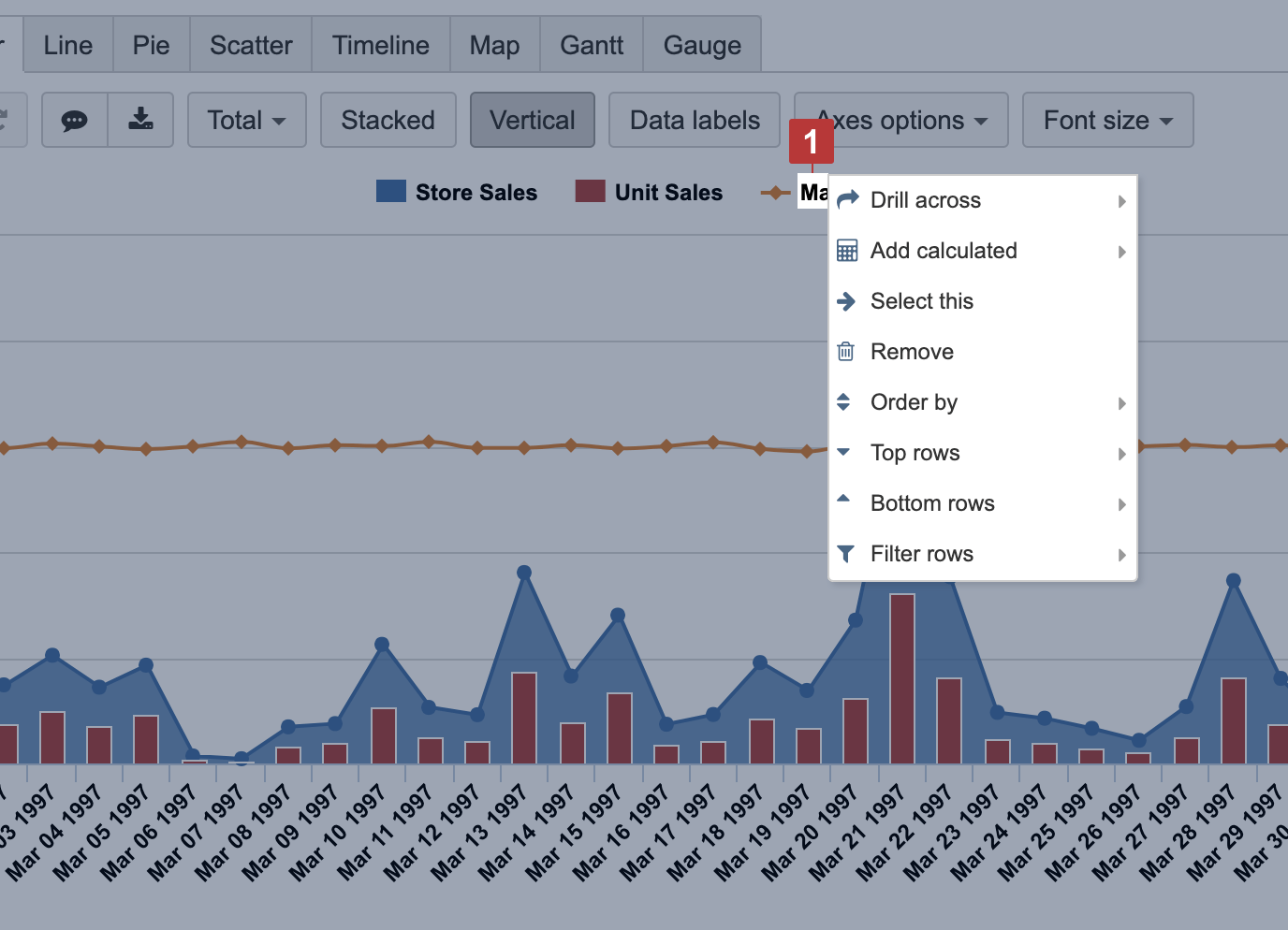
Clicking on a measure name to access the same built-in options for data representation as you have in a table view. You may order data by measure value, drill across another dimension, select only one member for a report or remove a member chosen from a report, select top or bottom rows based on measure chosen, filter rows by text pattern or value range.
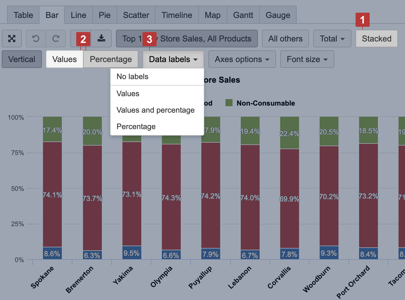
Relative data comparison
You can choose to show relative data comparison as Percentage [2] for Stacked [1] items in Bar and Area charts. You can represent each proportion value as numbers and as a percentage [3] of the whole bar.