When you have created several reports and charts then you can create dashboards which can show several reports on one page. Dashboard page with all key reports about the specific business area can provide a quick overview of the current business status and key performance indicators.
If you would like to share your reports on some web page using iframe or post them on big screens using wallboard option, or send on email, first, create dashboards in flex.bi. And only then you can share this dashboard as you see fit.
Create a new dashboard
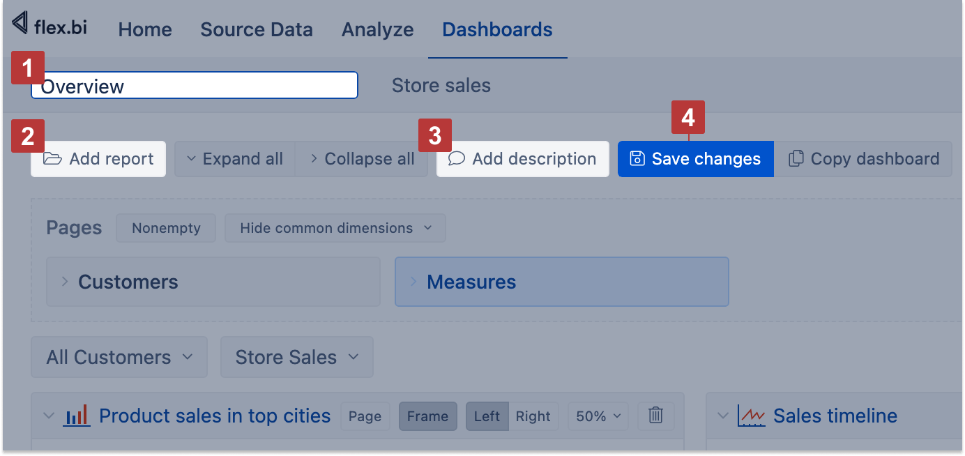
Go to the flex.bi tab Dashboard and choose the option Create a new dashboard or New. Enter the name of the dashboard [1]. By default, flex.bi will add a new dashboard as the last one, but you can drag a dashboard by name and order dashboards differently if needed. Then add reports you would like to include [2] in the dashboard. You can add a dashboard description as plain text, markdown, or HTML formatting [3] to share more information about reports or a logo on it. Finally, click to save changes [4].
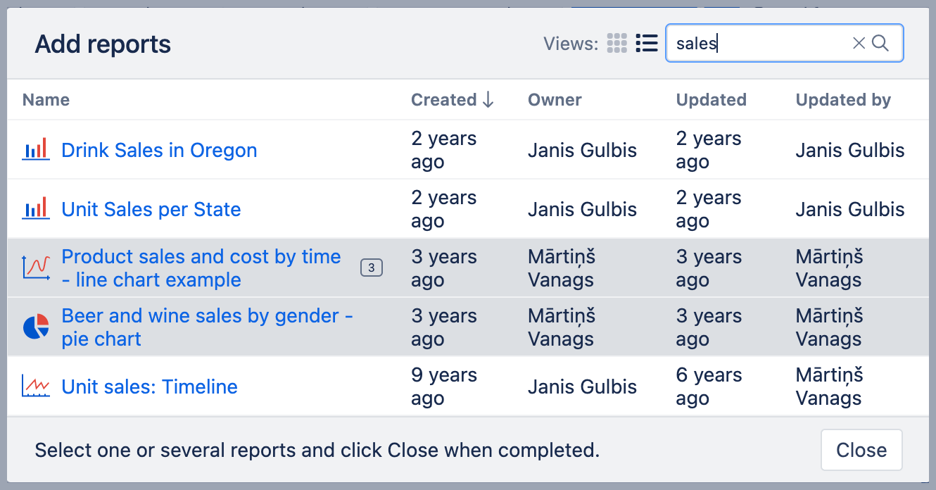
You can add several reports to the dashboard. You can add multiple instances of the same report on the same dashboard; this option is useful for running the same report with different filter options and seeing the results side by side.
In the add reports dialog, click on the report names you want to see in the dashboard; flex.bi will highlight which reports are already selected and automatically added and how many times (if more than one). You can remove some of the added reports when arranging reports.
Arrange reports
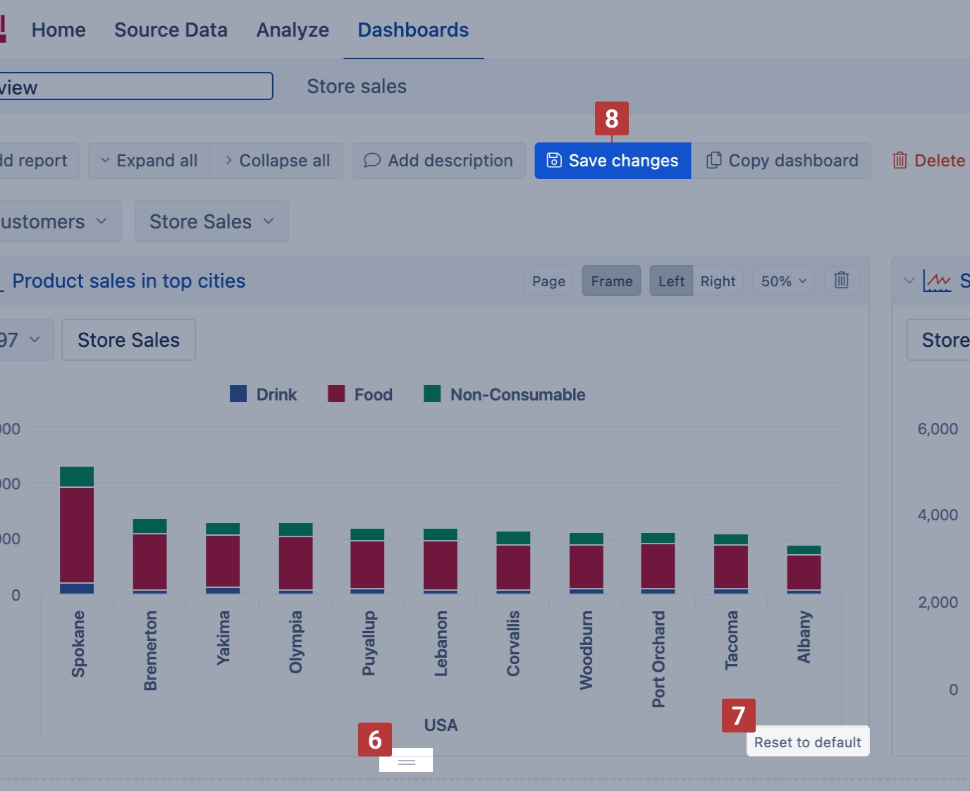
You can adjust the placement of reports by dragging and dropping them, inserting a page break [1] (if Export to pdf is enabled) between reports, removing frame [2], and changing the report's relative width [4]. By default, flex.bi organizes reports on the left side, and reports are placed next to each other if there is a place for more than one report on a row based on their relative width. You may force report alignment on the dashboard's left or right side [3], which might be useful for narrow or long reports. You can represent individual reports or all reports collapsed [5] in the dashboard, thus saving place. This option is handy when publishing table reports with a long or changing row count and reports that are quite resourceful and rarely used.
It is more convenient to rearrange reports while they are collapsed; use the feature Collapse all. When reports are reorganized in new places, you can expand all reports and proceed with minor adjustments.
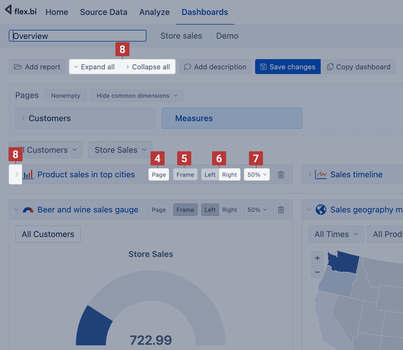
By default, flex.bi dynamically calculates the height of the reports. You can change and fix the report height [6] when editing the dashboard. If you show several reports on the same row then adjust them to the same height to ensure that they are always aligned when changing the browser window size. Click Reset to default [7] to return to the automatic report height calculation. When dashboard layout adjustments are done, don't forget to Save changes [8].
Arrange dashboards
You can adjust the placement of dashboards by dragging and dropping them. To change the position of a particular dashboard, press Edit to go into edit mode, and then you can grab the dashboard by the name tab with a mouse click and move it to the right or left. Don't forget to Save changes when you are done.
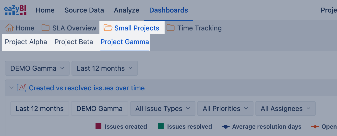
Arrange dashboards in folders
You can arrange dashboards in folders. Dahsboards share folders with reports; you can manage dashboard folders (create new, rename, or delete them) from the Analyze tab.
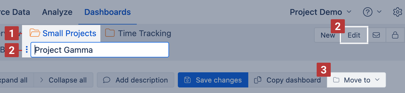
A new dashboard is created in the opened folder [1], and by default, folder reports are displayed for adding, but you can add reports from other folders too. To move the dashboard to another folder, open the dashboard in edit [2] mode, click Move to [3], and select the dashboard folder for destination.
Page filters for dashboard
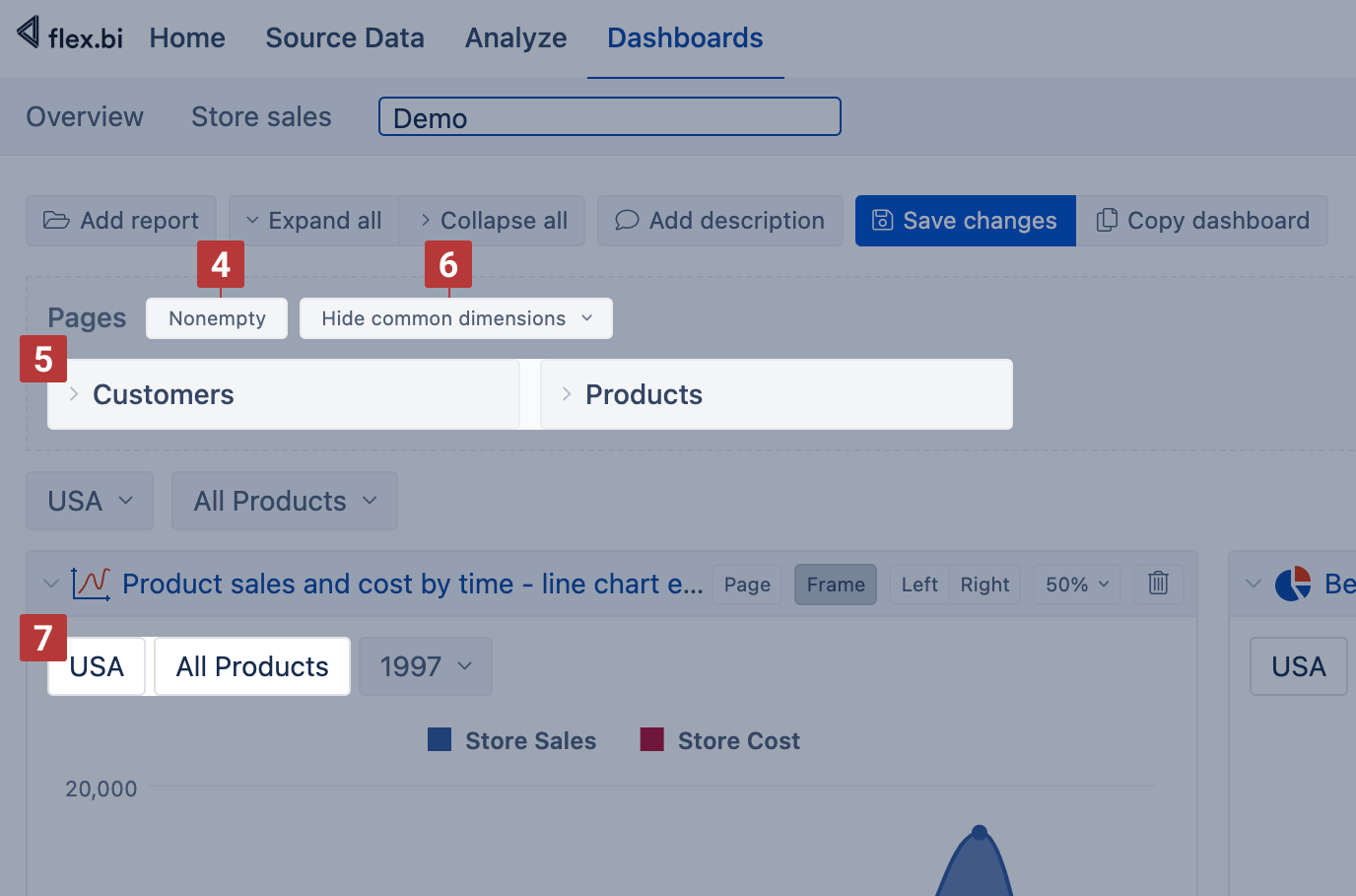
If multiple reports have the same dimension used as a page filter [1] (e.g., Time dimension to select a necessary period, or Product as in the example below) then you can add this dimension for the whole dashboard as a page filter. Open the dashboard in edit mode and make sure reports are expanded. In the report area, click on the page dimension you would like to bring out and choose the common page [2]. The chosen dimension will appear on the top of a dashboard [3]. See the feature used for the Customer dimension where value USA is selected as a common page filter for all dashboard reports.
.png?cb=ff4479552bf373a5d2039f414c807691)
If multiple dimensions are in the pages section, an additional option Nonempty for pages is available to limit dimension members for the page filter drop-down lists [4]. The limitation is based on the dimension order, the selected value on the left dimension limits the value list for the dimensions on the right [5]. You can enable the Hide common dimensions feature [6] to hide the dimension from dashboard reports [7] since it is now filtered by a common page filter.
When you save the dashboard, all current common dashboard page selections are saved as well for this dashboard (and in this dashboard will override default page selection in included reports). All non-common report page dimensions after dashboard page refresh will use default report page selection.
After saving the dashboard you can select dashboard page dimension members and all reports which have this page dimension will refresh results.
Interact with dashboard
There are two additional features in flex.bi to interact with the dashboard.
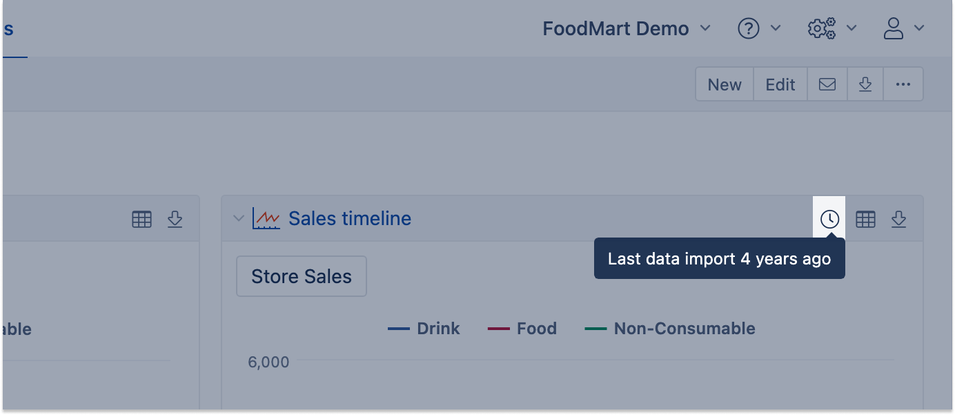
Show the last import time
When hovering the mouse on the report frame, the new button with the "clock" icon appears. On mouseover (after a few seconds), this icon will show when was the last successful import in your flex.bi data cube.
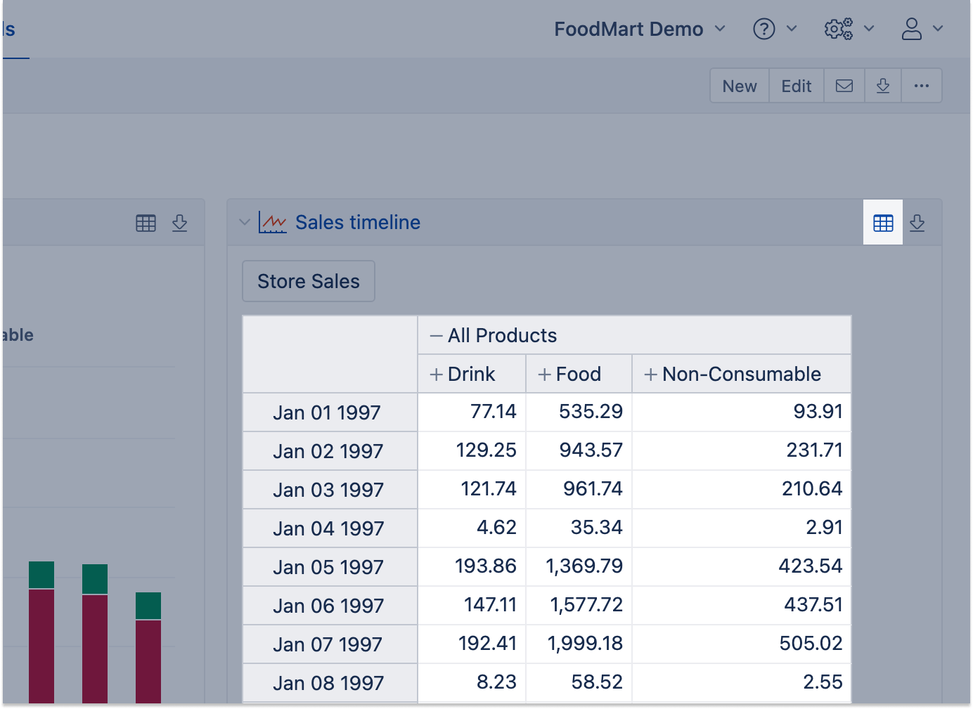
Switch to table view
There is a feature to switch charts to table view temporarily. It will be reset once you reload the dashboard again.
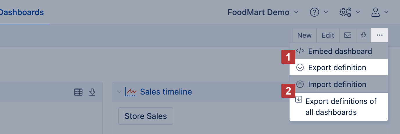
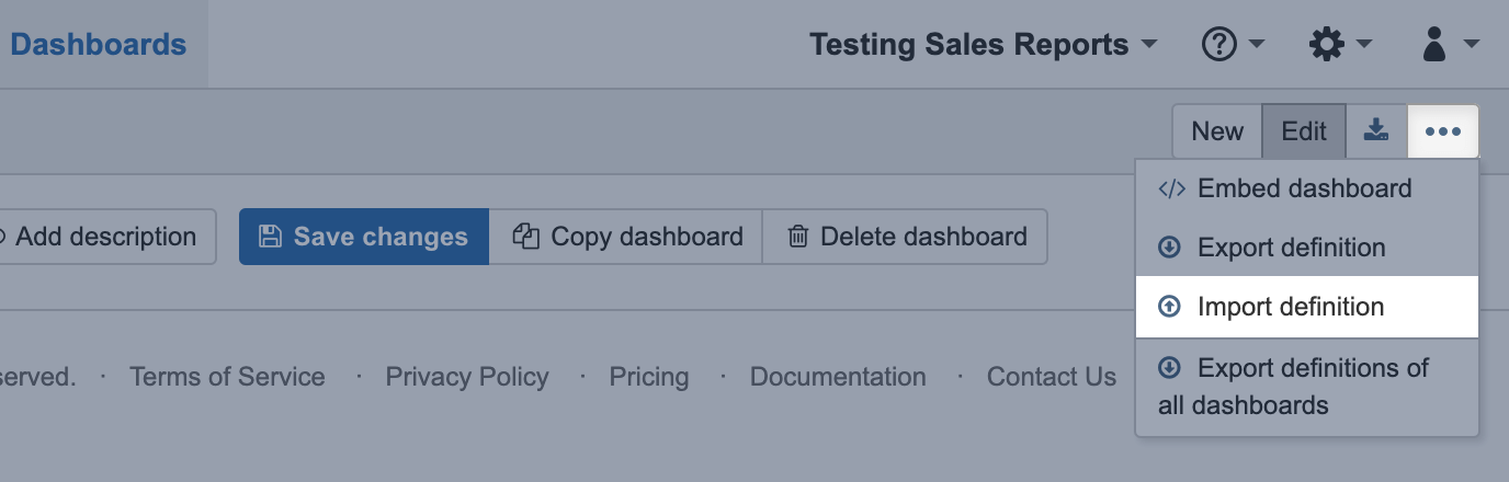
Export and import dashboard definitions
If you have several flex.bi accounts or several flex.bi environments (development, test, production) then you can export dashboard definition from one flex.bi account and import into another. Exported dashboard definition includes all report and calculated member definitions that are used and needed for this dashboard as well as report layout in dashboard and common page filters.
On the dashboard header toolbar, click on the Export definition [1] to copy the layout of currently selected dashboard or Export definitions of all dashboards [2] to copy all visible dashboard from current flex.bi account.
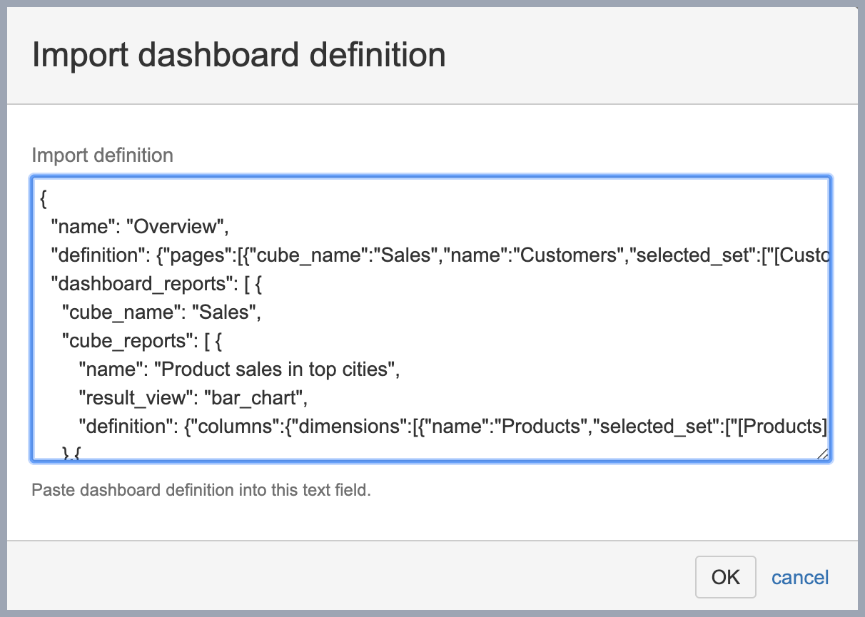
You will see dashboard definition in JSON format, please copy this definition for pasting it in the other flex.bi environment.
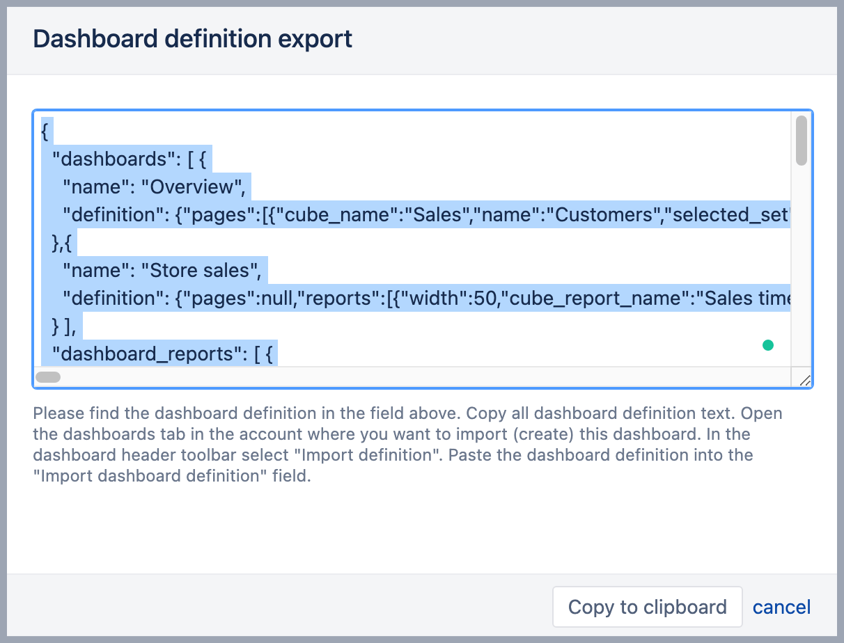
Now you can visit the other flex.bi account where you would like to import one or several exported dashboards and chose option Import definition.
In Import dashboard definition dialog paste previously copied one or all dashboard definitions and click OK.
After import will be done you will be able to see and use imported dashboards in the new flex.bi account.
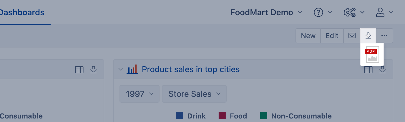
Export to PDF
You can export a dashboard to PDF. If you use flex.bi Enterprise and do not see this option, contact your flex.bi administrator and ask to install Google Chrome on flex.bi server.