Getting Started
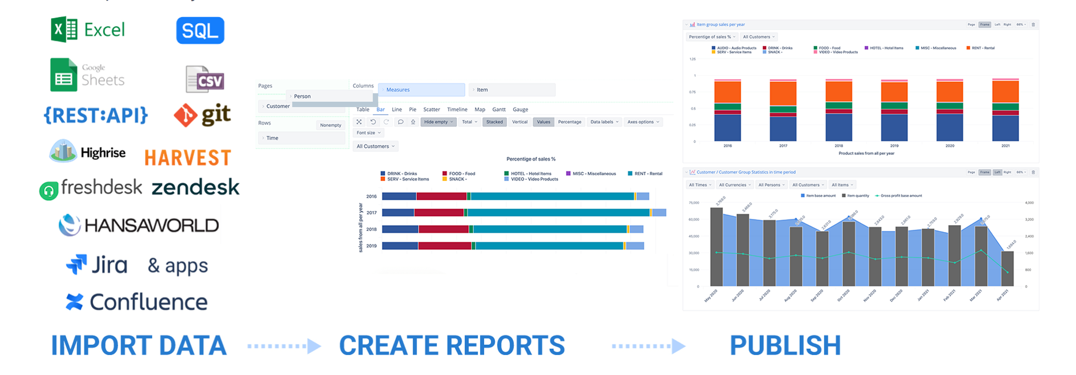
flex.bi is a powerful tool, providing easy-to-use drag-and-drop creation of custom reports, charts, and dashboard gadgets. Import your data from excel, CSV file, Google Spreadsheets or using REST API, or SQL select. Visualize, and analyze all your data using many chart types and share reports with your coworkers.
First of all, Create new account to create a data cube and start using flex.bi. You may have several accounts for different data sources and reporting purposes.
There are more details for the account owner (you) on how to set up and manage flex.bi accounts:
- Subscription plans for flex.bi Cloud (flex.bi/bi)
- Manage account users who can see the reports and work with them
IMPORT DATA
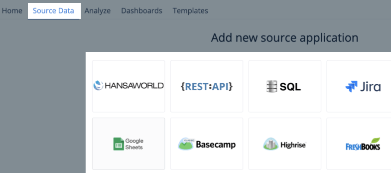
Go to Source Data tab and select data import from SQL SELECT, REST API, Google Sheets, Excel file, or source system flex.bi has an integration.
Map your data columns as you would like to use them in the reports to group data and aggregate quantitative values. Here are some rules to guide you through the data mapping process.
Usually, data mapping is done once when introducing the new data source. Now you are set up and ready to take a different look at your data with flex.bi.
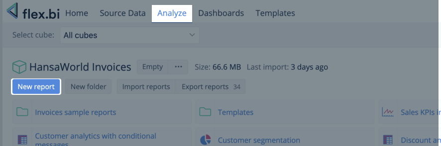
CREATE REPORTS
After mapping and importing data, go to Analyze tab and explore data by creating New report. It would be essential to understand the report building blocks, measures, and dimensions before making flex.bi reports.
To help you get started and get more ideas on what you can do with flex.bi, explore more report examples in flex.bi Demo account:
This training video might help you catch up: First steps in flex.bi – Editing reports
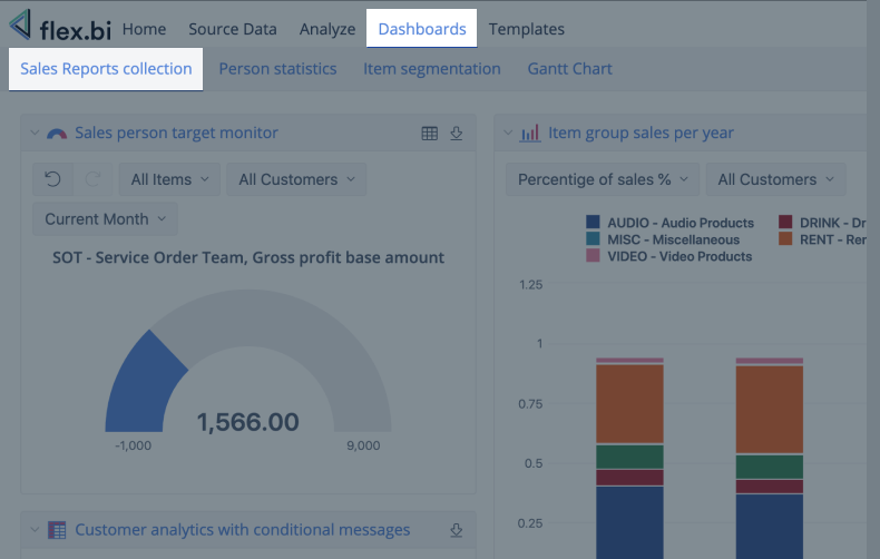
PUBLISH REPORTS
When you have created reports, you can share them with your colleagues, partners, peers, and customers. You can organize and publish reports in flex.vi Dashboards. Also, share reports in an environment where users are working or spending most of their time, like WEB pages.
See Also
- Let's get started videos - First steps in flex.bi business intelligence and reporting tool.
- Training videos on specific topics - various training topics for different user levels.
- flex.bi Newsroom - to keep up on the actualities about flex.bi, recent product releases, customer use cases, and other topics.
- flex.bi Demo account - report templates ready to use and get ideas how to build reports.