Create reports
If you have not read it yet then please start with an overview of flex.bi concepts.
Here you will find the main steps on how to start analyzing your uploaded or imported data and create and save reports. Go to the Analyze tab and follow these instructions. You can also try these steps in the demo Sales cube.
Drag dimensions to columns and rows
Select dimensions across which you would like to analyze your data (measures). In this example, we would like to analyze who are our best customers based on the sales amount.
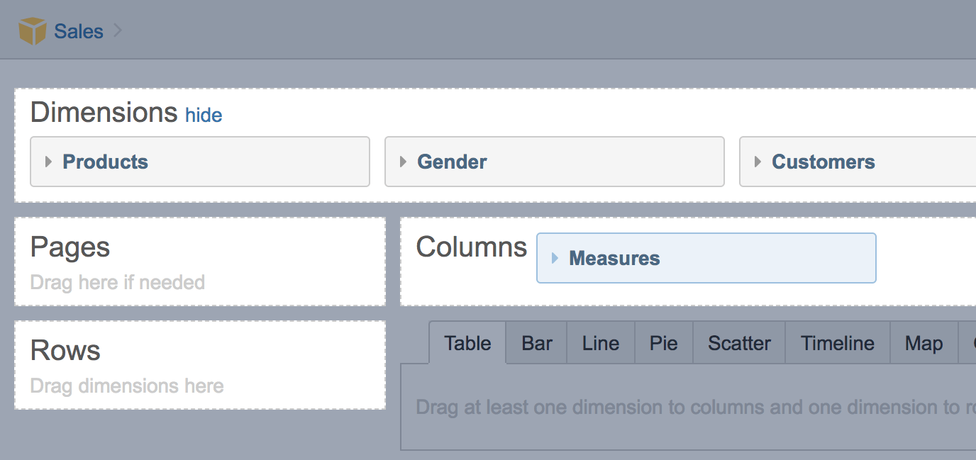
One or several default measures [1] are already selected in the report columns. You can select just one measure you would like to analyze or select other measures. You may move Measures [2] to rows or pages while you can't remove them from the report altogether.
There is no difference in the report results whether you select a dimension in the report rows or columns; it affects only the report layout. Usually, Measures are selected in columns and dimensions with a lot of selected members on rows.
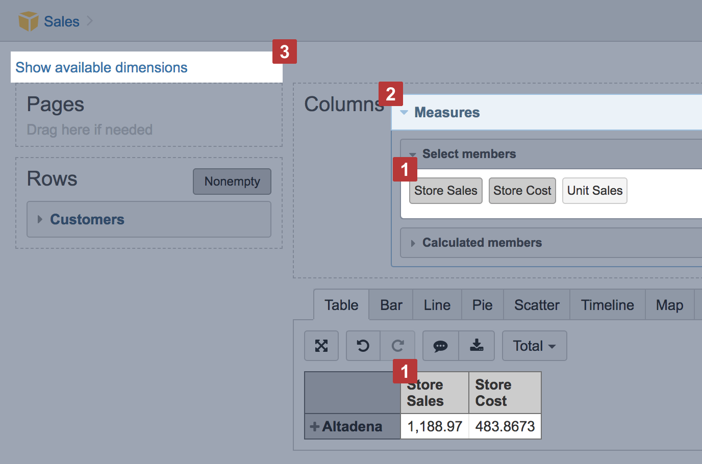
After you have selected all needed dimensions for the report, hide the dimension section [3] to get more space for the report results. You can always unhide dimensions.
Expand and collapse, rearrange measures and dimension members
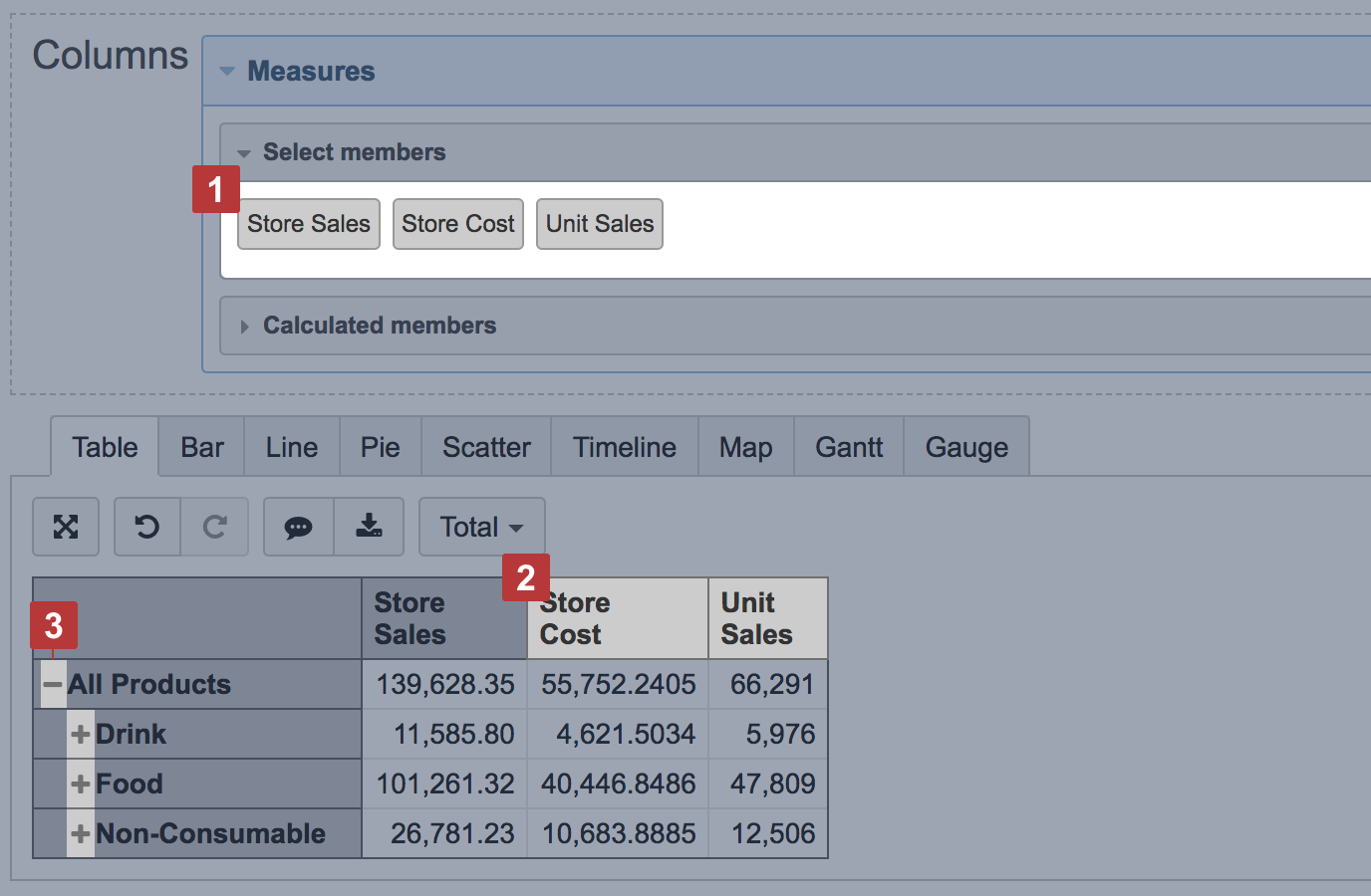
You can expand and collapse [3] selected dimension members to show detailed hierarchy level members (e.g. start with all customers and expand into countries, regions or states, cities, and individual customers). You can add or remove [1] selected measures in columns or rearrange them with drag and drop [2]. If added one by one, measures are displayed in the same order as they were added to the report.
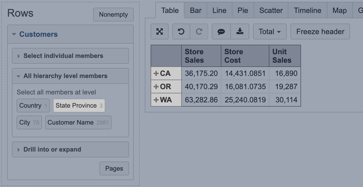
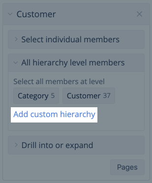
All hierarchy level members and member actions
Instead of expanding hierarchy levels from the top, you can select all hierarchy level members (e.g. all countries, state provinces, cities, customers). And then you can order them by selected measure or select other available member actions. Read also about more advanced filters using date filters and regular expressions.
Rearrange dimension member order in the report
The sequence of dimension members in rows or columns is set automatically. To rearrange them, bookmark dimension members and then add them to the report one by one in the needed order.
Another option is creating a calculated member in the same dimension with members in the correct sequence and then using this calculated member instead of the All hierarchy level members.
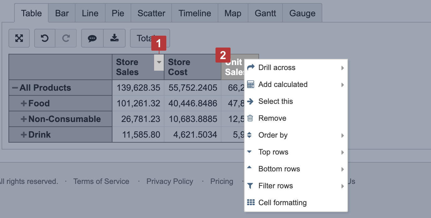
Order and filter rows by measure values
When clicking on a column header, there are several built-in options for data representation. You may order rows by measure value [1], drill across another dimension, select only one member for a report or remove a member chosen from a report, select top or bottom rows based on the measure chosen, filter rows by text pattern or value range, format cells according to their values [2].
Drill into measure by another dimension level
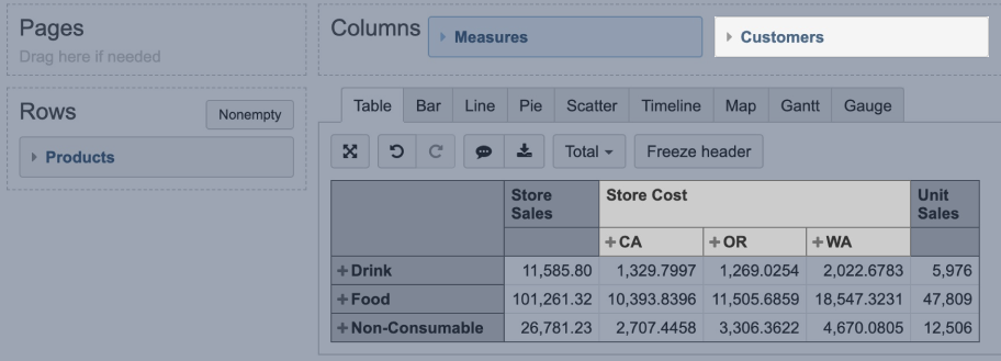
By default, all measures selected in the report columns are cross joined by all members of the dimension selected in the columns with the measures. To cross join only one particular measure with a particular dimension level, you may use the option Drill into – click on the measure, select "Drill into" and the dimension and the level you need.
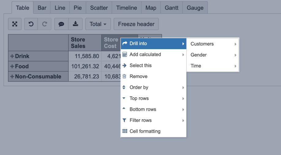
For example, if you select to drill into Customers dimension State Province level for measure Store Cost, the Customer dimension would be added to the report Columns next to the Measures and measure Store costs would split by Customer dimension State Province level members. Other measures won't be drilled into this dimension and will be left at the summary level.
Drilling into only one dimension for one measure is allowed in the same report. Changing order of dimensions in Columns (moving Measures after the added dimension) all measures will be drilled into this particular dimension level, which was added through the "Drill into" option.
You may remove the dimension by clicking on the same measure and using the Remove drill into option.
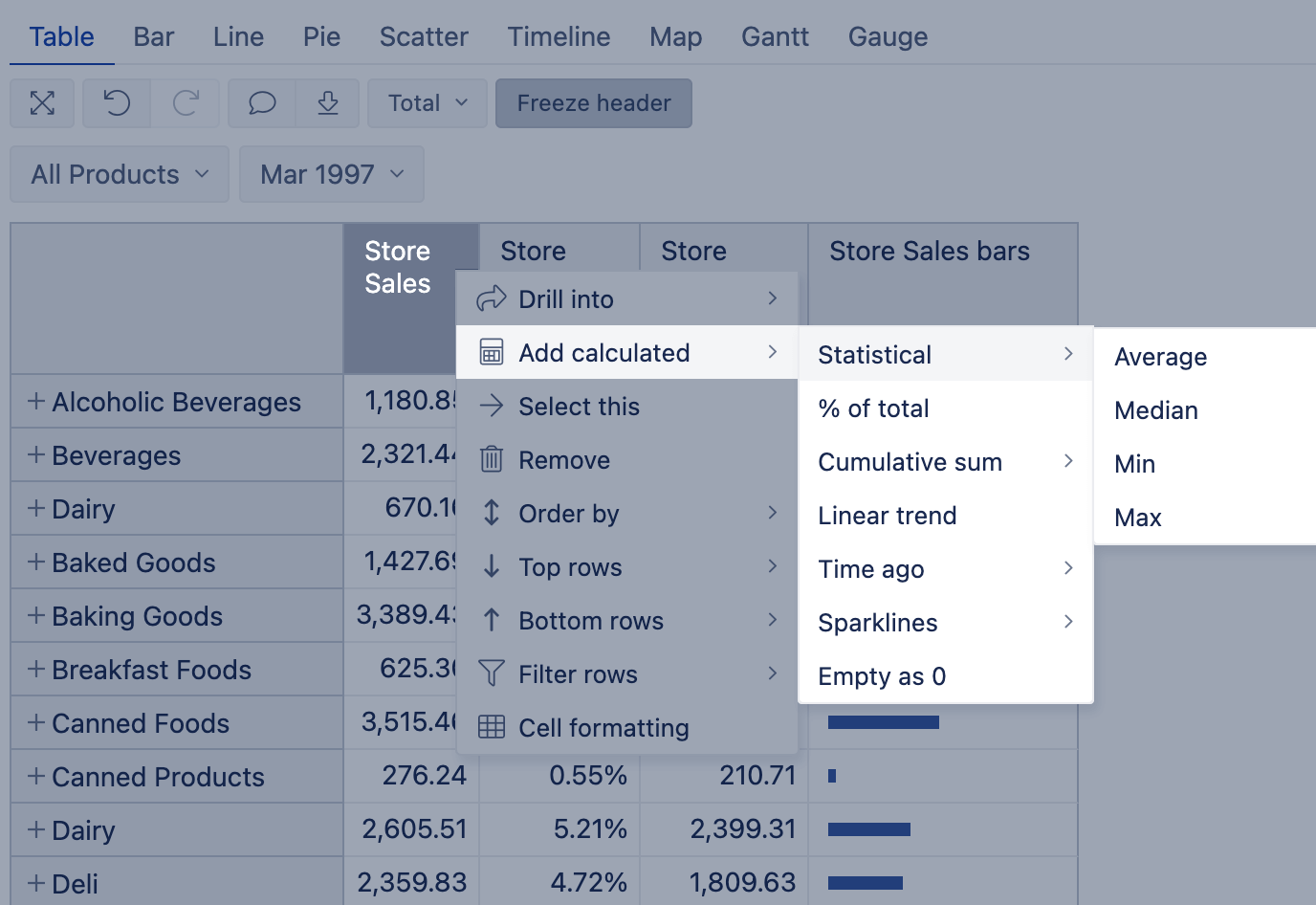
Add standard calculations based on a selected measure
When you have selected some numerical measure for a report, you can select Add calculated to add some standard calculations based on the chosen measure and visible data in the report.
- Statistical calculations return the Average, Median, Min, Max value of all values on report rows.
- Calculate a % of total value from the sum of all rows.
- The cumulative sum has an option to add values either with or without empty values in any row for this measure.
- The linear trend generates a straight line representing the trend for this measure on visible rows.
- Time ago calculations work with the Time dimension on Rows on a particular level (Month, Week, Day). You can analyze Time on Rows compared to Previous Period (works dynamically for any selected time level), Month ago (pulls in values month ago, suited for Day level), Year ago (pulls in values from a year ago for any selected time level). You can pull in values of the period, compare changes, or changes % to the selected period back in time.
- Sparklines make the table more informative by visualizing compared values with bars or giving a quick overview of the measure changes over time. Make sure to choose the Sparkline formatting that best represents your data. To change the color of the Sparkline, choose the text or background color in the cell formatting of the Sparkline column.
- Standard calculation Empty as 0 could be used for cases when there are no values in measure and you would like to treat those values as 0.
When you select to add a calculated measure, for example, add calculated % of total, then flex.bi creates an additional column with the calculated percentage for each row from the total value in the all visible report rows; this new calculated measure is report-specific and will not be available for other reports.
Add members to Time dimension
The dates in the Time dimension are created dynamically - days are added only if there is some activity on that particular date.
If you wish to add some analysis of future or past Time periods that you do not see in flex.bi, it is possible to add these Time members in the Time dimension / All Hierarchy level members.
This option is available for the users with account Owner, User Admin, or Data Admin user roles.

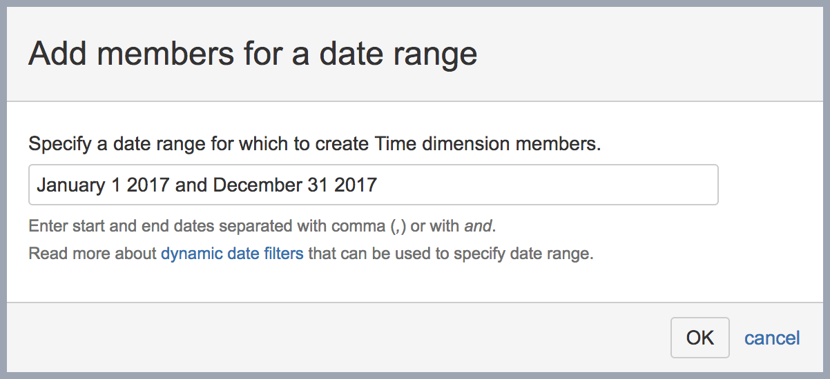
To add date range you should use exact date name or relative date descriptions. After clicking OK you will see a confirmation screen indicating how many Time dimension day level members will be created; click Yes to proceed and create new Time dimension members that can be used to show e.g. forecasts or comparison when not all last year data exist.
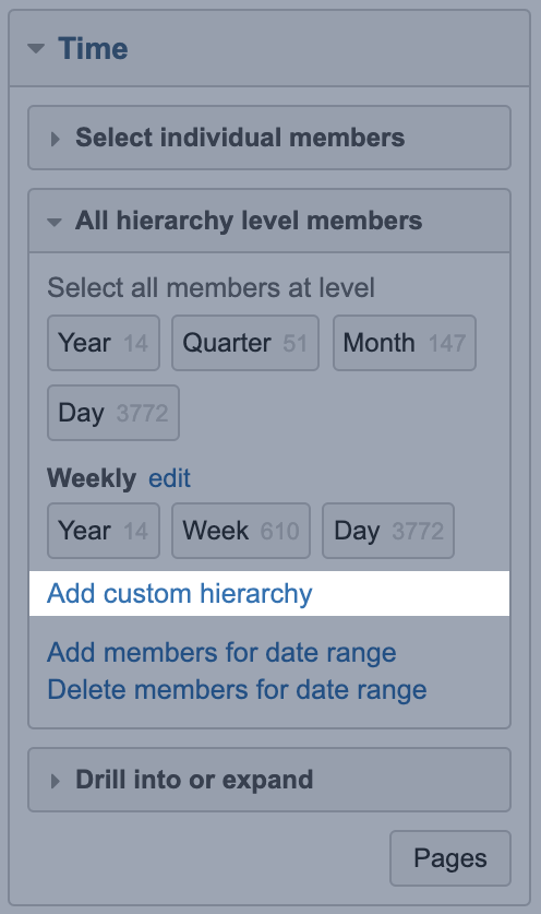
Add custom hierarchies to Time dimension
When you import data in flex.bi there are two hierarchies in the "Time" dimension - default and weekly.
For week numeration flex.bi is using ISO standard, which means the first week of the year always will have January 4.
You can add custom hierarchies to the Time dimension with the Add custom hierarchy option:
There are two types of custom hierarchies possible. First, you can create your custom fiscal hierarchy by selecting the month when your fiscal year starts:
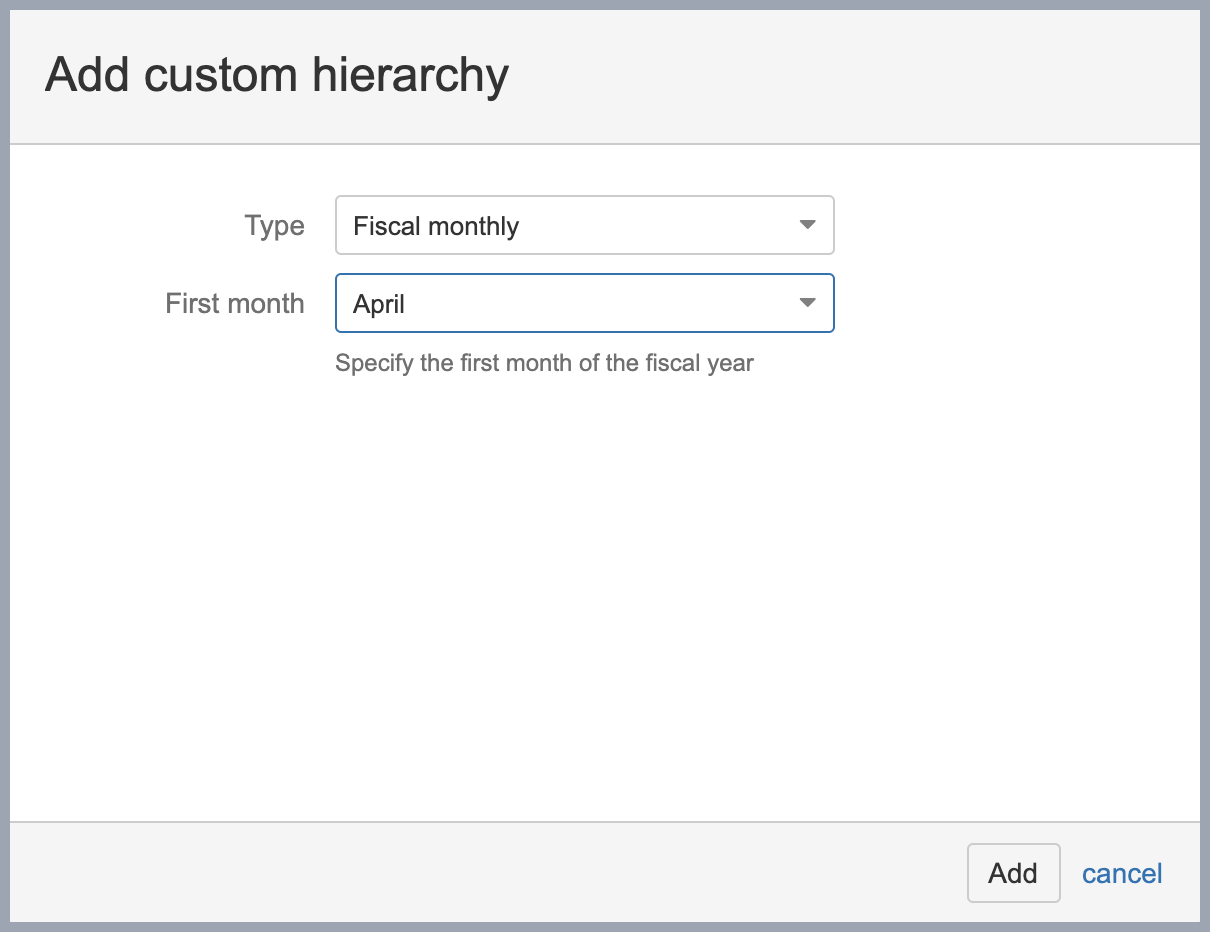
The fiscal hierarchy has the same levels as the default hierarchy of Time dimension (Year, Quarter, Month, and Day); it is possible to create only one custom fiscal hierarchy in the account. Fiscal hierarchy year and quarter member names are referenced by the year in which the fiscal year ends.
The other type of custom hierarchies allows creating hierarchies of multiple weeks. You can choose the option of two, three or four-week periods and select a date. The date determines from which day the week count is started:
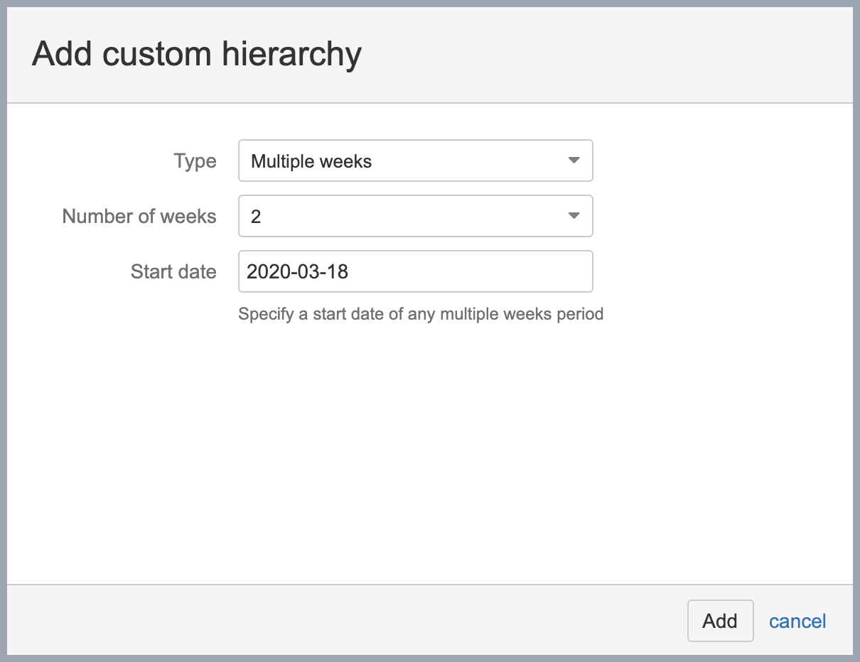
You can create one instance of each type of the multiple week dimension (two, three, or four-week periods).
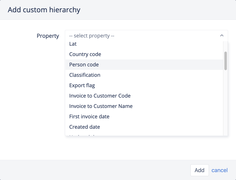
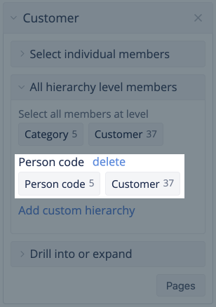
For example, you may create a new hierarchy in the Customer dimension based on the Person code property.
Currently custom hierarchies are supported by Customer, Person, Item, Account, Supplier dimensions. If these dimension members have at least one numeric or string property then you will see the option to add custom hierarchy.
Chose the property by which to group dimension members and add the new hierarchy.
flex.bi will create a new hierarchy with two levels, one representing the property you selected and another representing dimension members.
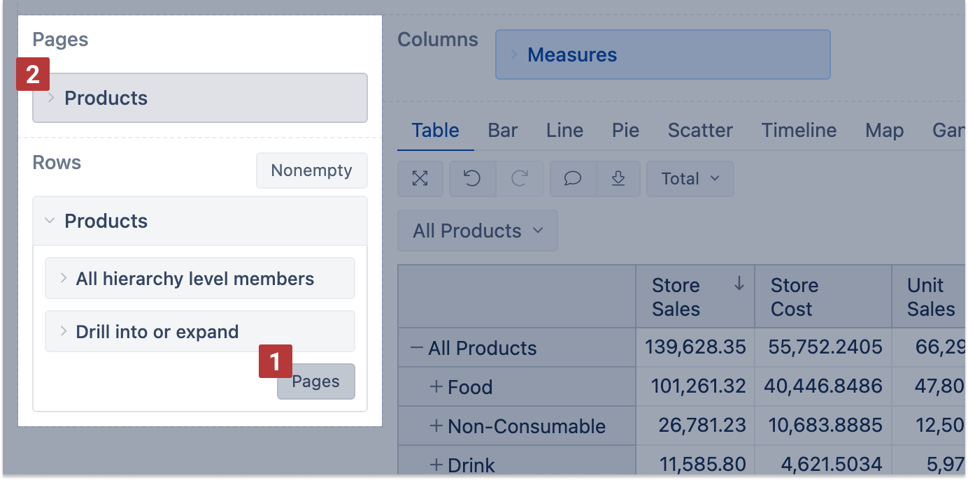
Page dimensions
You can drag dimensions to the pages section [1] to filter report data. Select one or several dimension members from the dimension drop-down list [3], and the filter is applied to all measures of the report. You may select one or multiple members in the filter [4].
If multiple dimensions are in the pages section, an additional option Nonempty for pages is available to limit dimension members for the page filter drop-down lists [2]. The limitation is based on the dimension order, the selected value on the left dimension [3] limits the value list for the dimensions on the right [5].
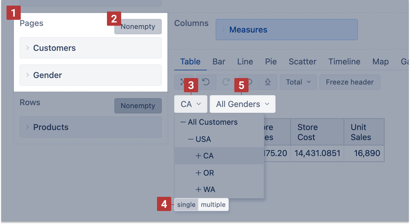
By default, all dimension members selected on rows will be visible while Measures will be shown only where applicable based on the filter. If you wish to see only dimension members that have values for selected filters, click on the Nonempty option in the rows section header. This will make a NonEmpty cross join with dimension members and selected measures - to show in rows just dimension members that have values based on the selected filter.
![]()
You may use one dimension in the report rows (or columns) and pages [1] at the same time. It allows to display the dimension members in rows and use this same dimension to filter them. It could be useful in cases if you want to display, for instance, months of any selected year, or only a few selected dimension members. If the dimension has several hierarchies, make sure the chosen hierarchy on pages matches the hierarchy on rows or columns. And when changing the hierarchy on rows or columns (for example, from Time default hierarchy representing months to weekly hierarchy), change it also on pages.
Change row dimension headers
You may add or change a header on columns containing row dimension members [1]. Choose to display the dimension name as a header, or edit and enter a custom display text.
Headers of measures can't be changed from the report view [2]. You may change the name of the measure itself (it would affect all reports where the measure is used) or create a new measure (or calculated member for other dimensions) with the needed name and then use it instead of originally selected.

Vertical column headers
It is possible to change the table report to show the column headers vertically. The option of the vertical header will appear automatically when the report width exceeds the size of the report design dashboard area, and the horizontal scrollbar will show up.
The “Vertical header” button will show up, and you can turn on the report to show the lowest level column headers vertically.
Save report and toolbar buttons
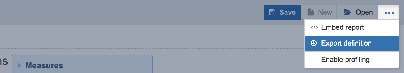
If you have created a report you would like to use later or you have modified the report or report specific measure and would like to save the changes, then save it from the report header toolbar [1]. If you edit the existing report and would like to save it as well as to keep the previous report, click the save as button [2] and give the report a name. This will save the new report and leave the previous report as it was. There are also other report actions in the report header toolbar, e.g. to create a new report [3], open another report [4], rename, mark report private, delete report, Export and import report definitions, or embed reports in other HTML pages or publish on wallboards [5].

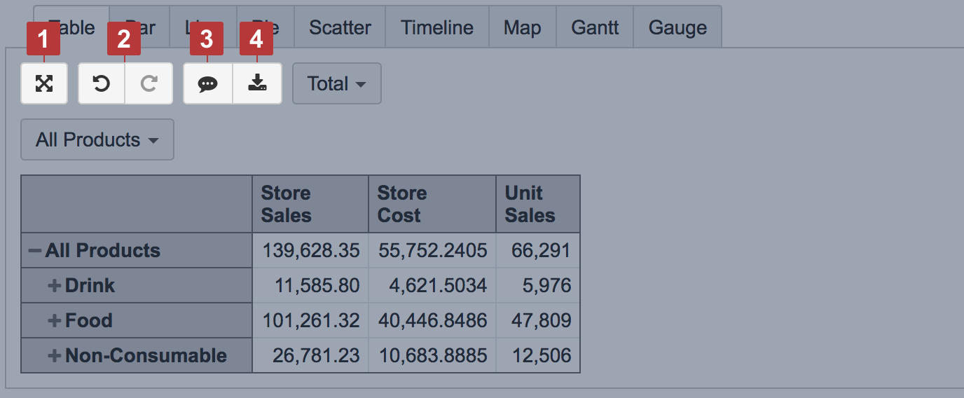
You can try out some options for report result configuration in the report results toolbar - maximize [1], undo & redo buttons [2] as well as adding report description [3] and exporting results [4] to file in CSV, XLS, PNG, PDF formats.
Export and import report definitions
If you have several flex.bi accounts or several flex.bi environments (development, test, production), you can export report definitions from one flex.bi account and import them into another flex.bi account.
You can export and import definitions of template reports from our Demo Account.
To export individual report definition click on other report actions in the report header toolbar and select Export definition.
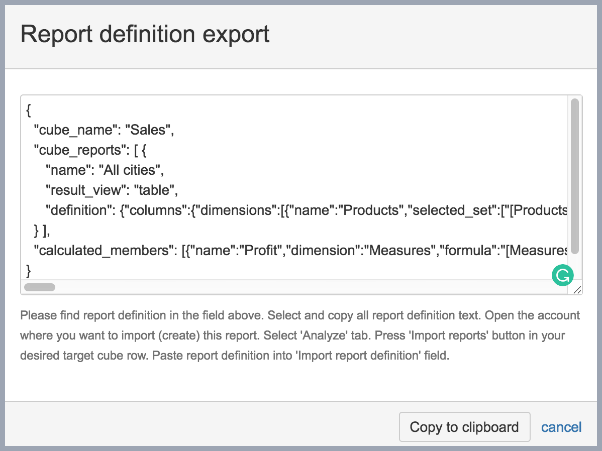
You will see the report definition in JSON format, please copy this report definition for pasting it in the other flex.bi environment. Exported report definition will also include all calculated member definitions that are used and needed for this report.
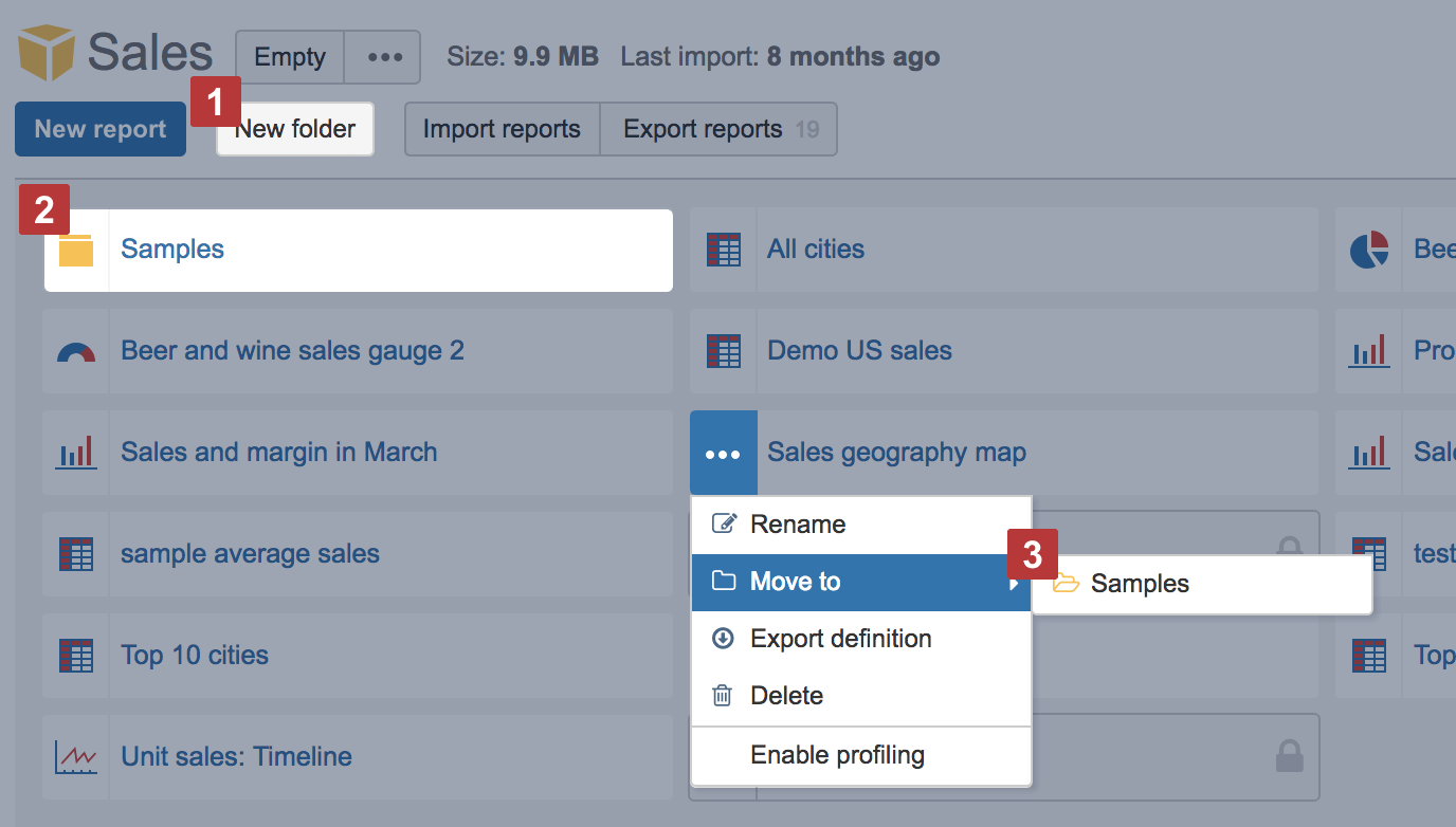
You can also export all report definitions for the selected cube from the Analyze tab by clicking Export reports [1]. If you have any private reports they will not be exported with all report definitions. Then you can visit a different flex.bi account where you wish to import one or several exported reports and click Import reports [2].

In Import report definition dialog paste previously copied one or several report definition export results.
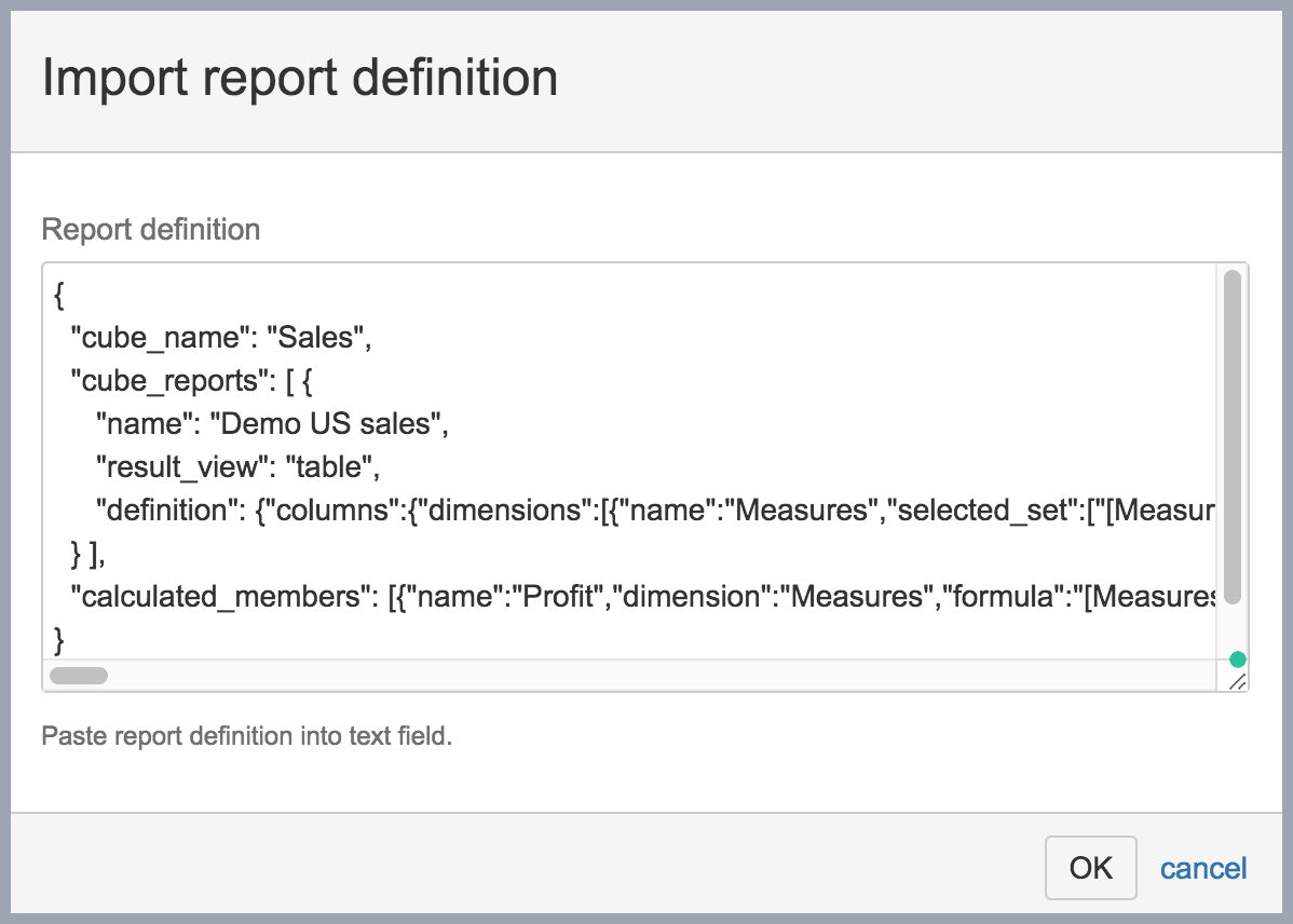
If there will be any warnings, please review them and confirm that you would like to continue with report import. After import will be finished you will be able to see and use imported reports in your flex.bi account.

Report folders
If you have created many reports, you can create report folders [1] and organize them in folders [2]. You can select a folder when saving a new report or move an existing report to a selected folder [3].
You can view your reports and folders as a grid (by default) or a list [1]. List view provides additional information about reports, like, who and when created reports and updated them. You can sear reports by name in all folders [2].
